1 (to) N is all about relationships and proportions. How we relate to ourselves and others, in an organization and in society. 1-N examines these links from an organizational, social, ethical and entrepreneurial perspective.
They're situated in a former church called Jacobus. From this idea of origin and relationships, Autobahn designed a visual identity for 1-N. An important concept for the identity is the relationship theory of Benedictine monk Dom Hans van der Laan (1904 - 1991).
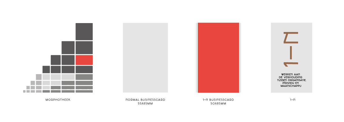
This theory shows us how objects are related. He called this 'the Plastic Number'. The typeface Jakobus is designed with cubes from the socalled Morphotheek to create a scale relation within and between glyphs.
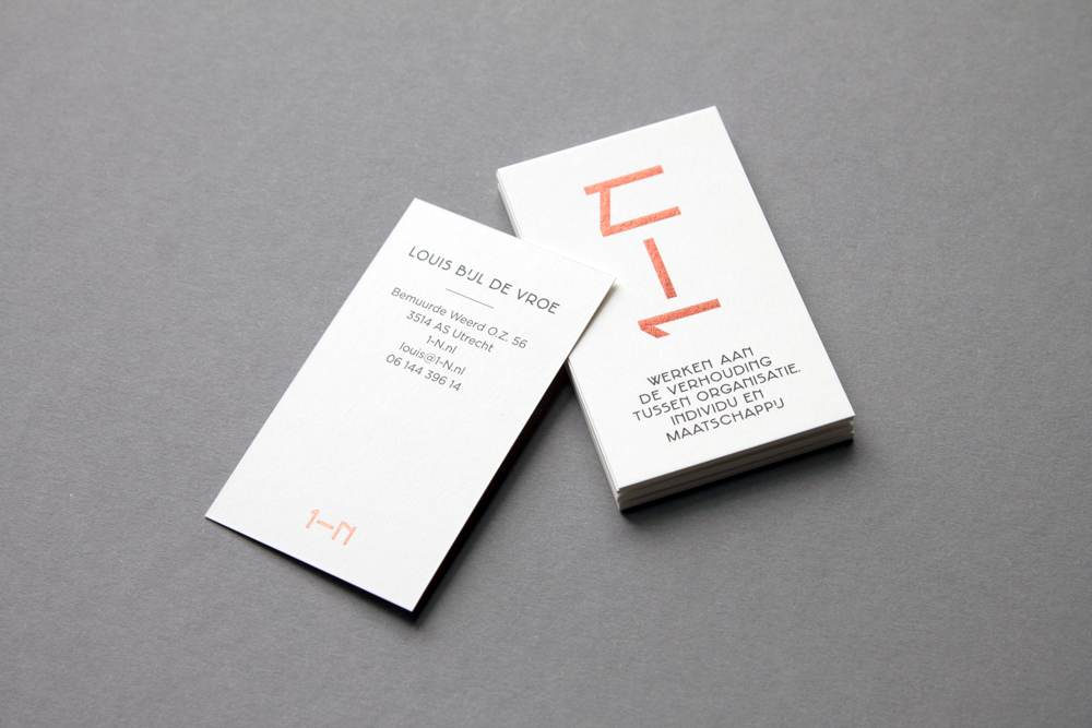
The stroke of the glyphs is based on the smallest width in the Morphotheek. The measurements of 1-N (print)materialsare also based on the Morphotheek. Printed in black on 350 grams Olin natural white with a copper foil and typeset in Gotham and Jacobus.


