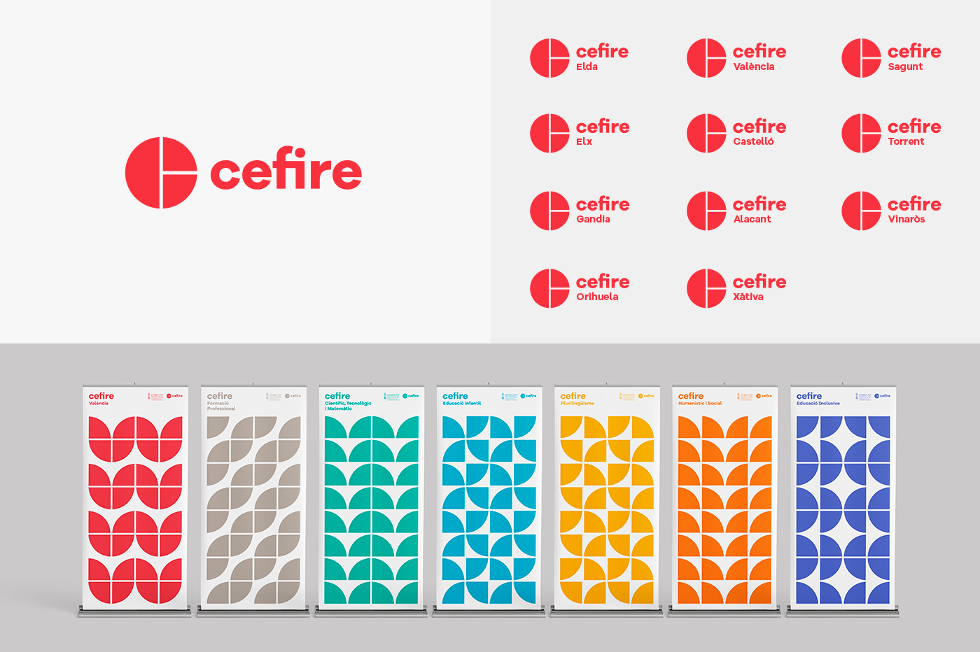
Cefire is the Center of formation innovation and resources for the professorship of the Valencian Community. The briefing defines a brand and identity for the Cefire and it’s 19 subbrands, 11 territories and 8 specialities.
The logo is a symbol formed by a letter "C" divided into three sections that define his areas, the formation, the innovation and the educational resources. This symbol is the link of union between the principal brand and the subbrands, accompanied of a geometric typography and happy colour range.
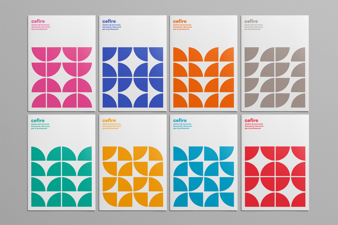
With the intention of communicating an education in constant evolution, we generated an organic identity with the pieces of the symbol creating different textures that are used in all the graphical supports.


