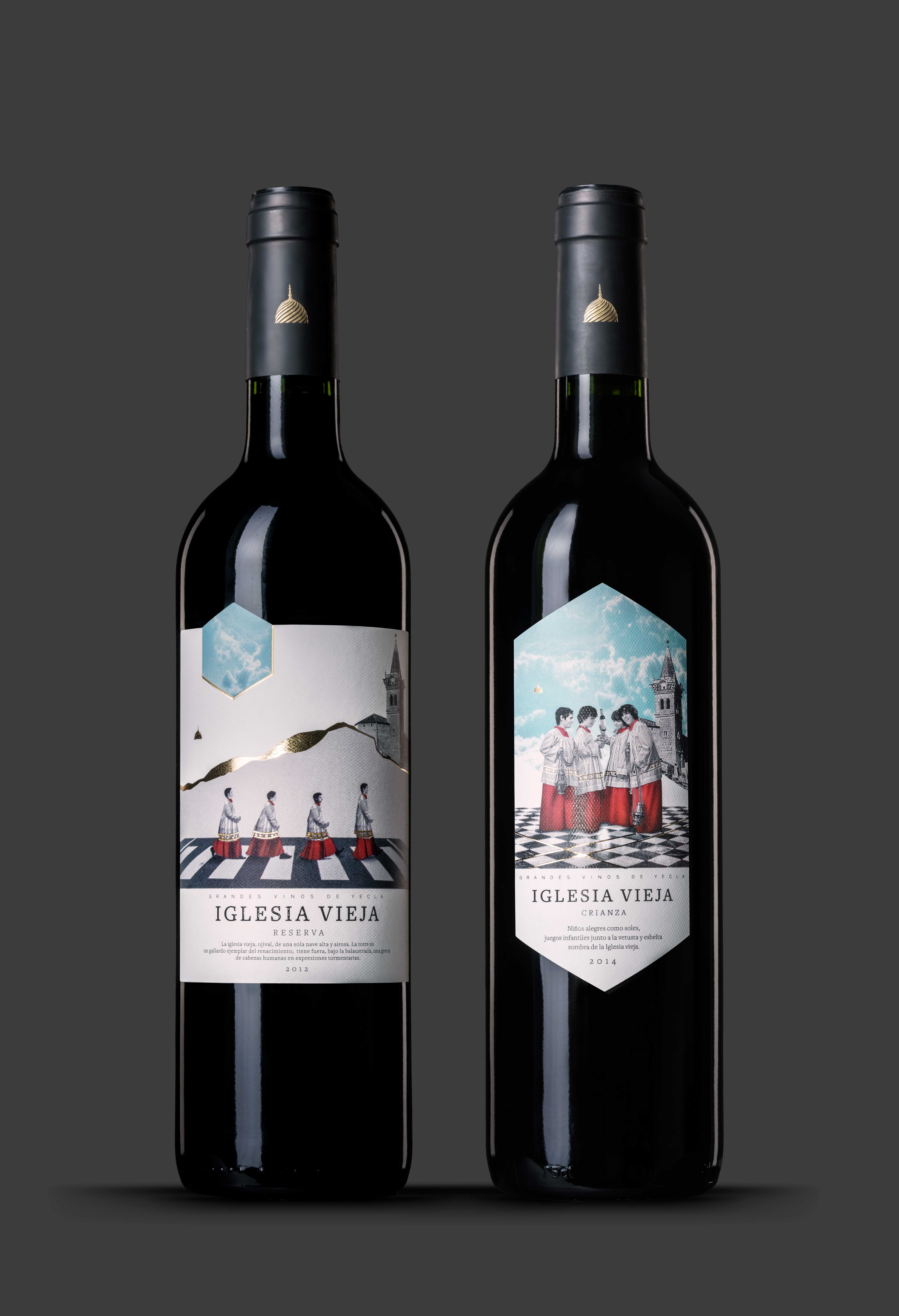
Product: Two red wines at mid price (Crianza and Reserva) from the region Yecla, made by the cooperative La PurísimaBriefing: Develop a new design for the labels of the existing brand IGLESIA VIEJA (old church)Creative solution: When we received the order to design the labels, the first that came to our mind was the literal meaning of OLD CHURCH.
The Catholic Church had a key presence during the 40 years of Franco's dictatorship. That´s why we asked ourselves: how could a modern, a young church look like, one without dictatorship, fear and oppression.
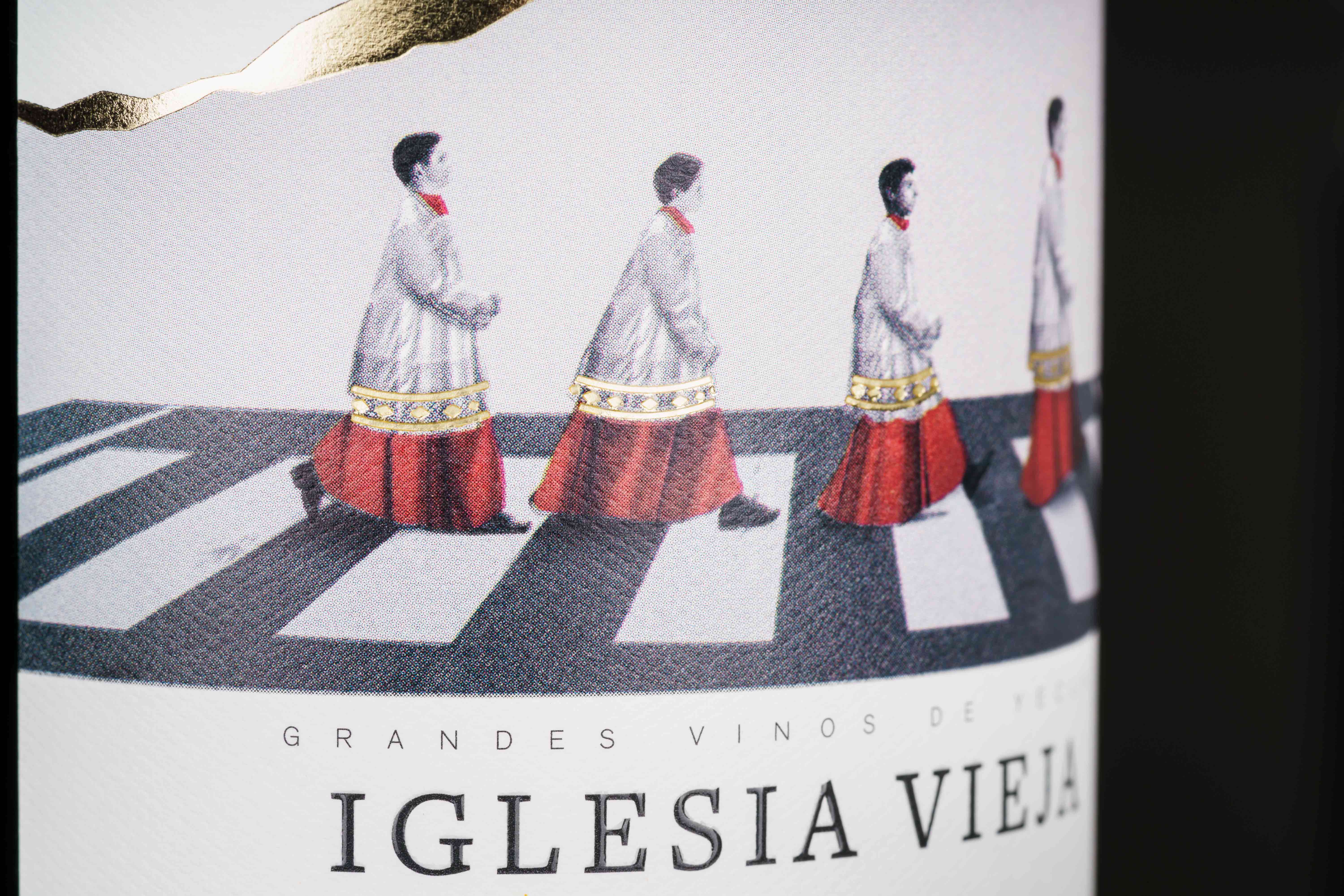
A church with humour! Starting out from our core idea of telling the story of the 4 young altar servers, the first two motives of the series were created: How the four run in their complete outfit to the church and thus re-invent the famous Beatles cover on Abbey Road.
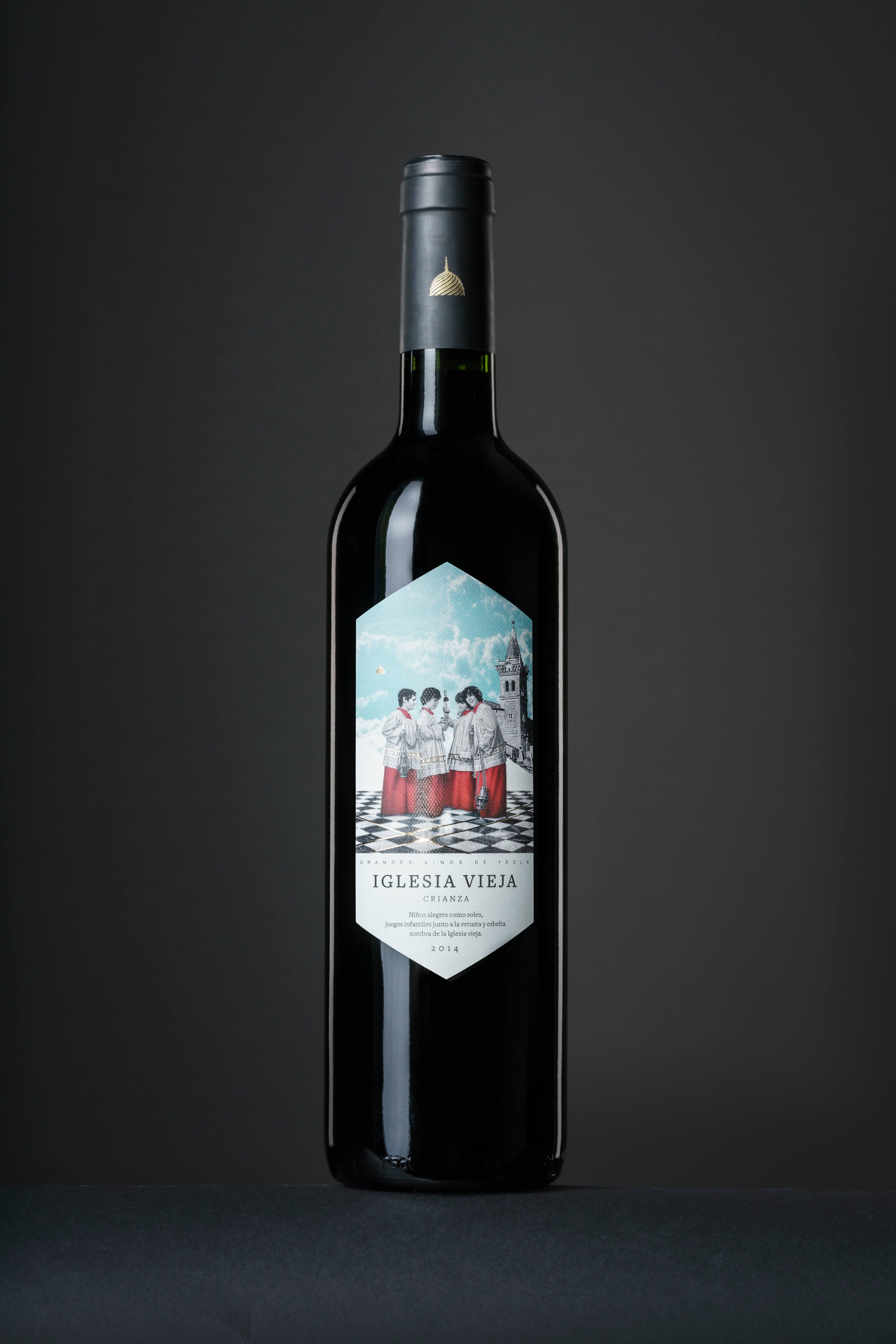
Or how the holy boy band "tastes“ all the remaining wine together after the service. Our favorite detail: the depicted faces are in part children's faces of employees of the studio as well as faces of their children ;)CD/AD: Francisca MartínDesign/Illustration/Composings: Paula Cano


