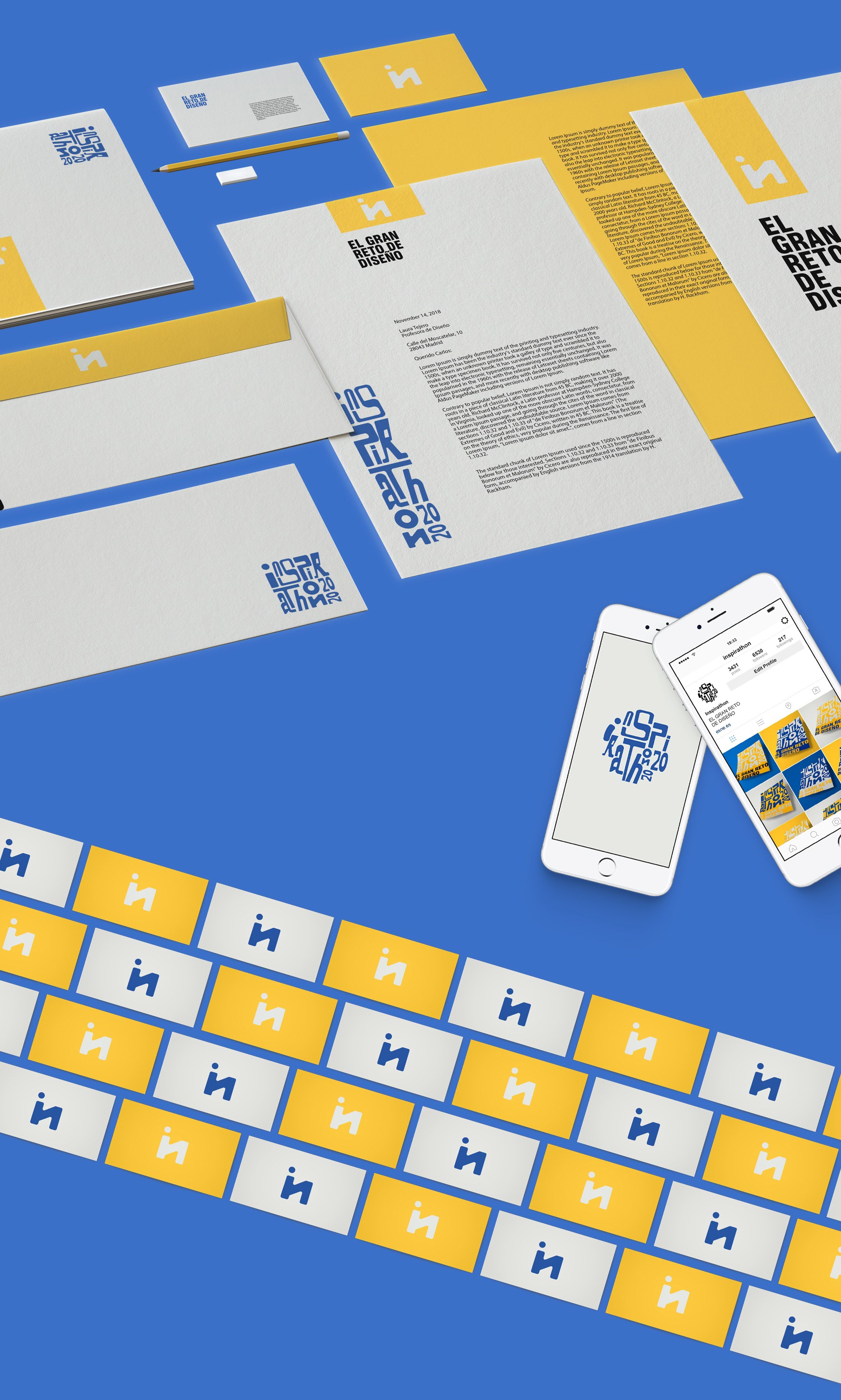
Creating a brand identity for this year's Inspirathon, the third edition of an innovative event that focuses on creative inspiration. This design contest is held every year at ESNE.
The brand logo is made through the set of letters of different thicknesses that provide dynamism and makes us see the contest in a fun way. In addition, this dynamism is the one that allows us to make the logo be placed in several locations: vertical, horizontal, square and round.
The isotype of the brand is formed by joining the first and last letter of the word inspirathon corresponding to the logo. The intention is that it is an abstract icon so that it can be used every year like the logo.
The claim allows us to play with the spaces when placing it next to the logo or isotype, separating the words as we see fit for their correct framing. In conclusion, the brand identity has a modern, trendy and minimalist approach.
It stands out for the concept of forming a harmonious set for all the pieces to fit into different applications.


