L’Avenir has mandated us to help position itself as a reference in Quebec’s dentistry market. To do so, it seemed crucial to refresh their branding and build their presence on the web.
Though anchored in a corporate field, this clinic sought to discard the stereotyped image of the industry. Therefore, our challenge was to make it more accessible to patients.
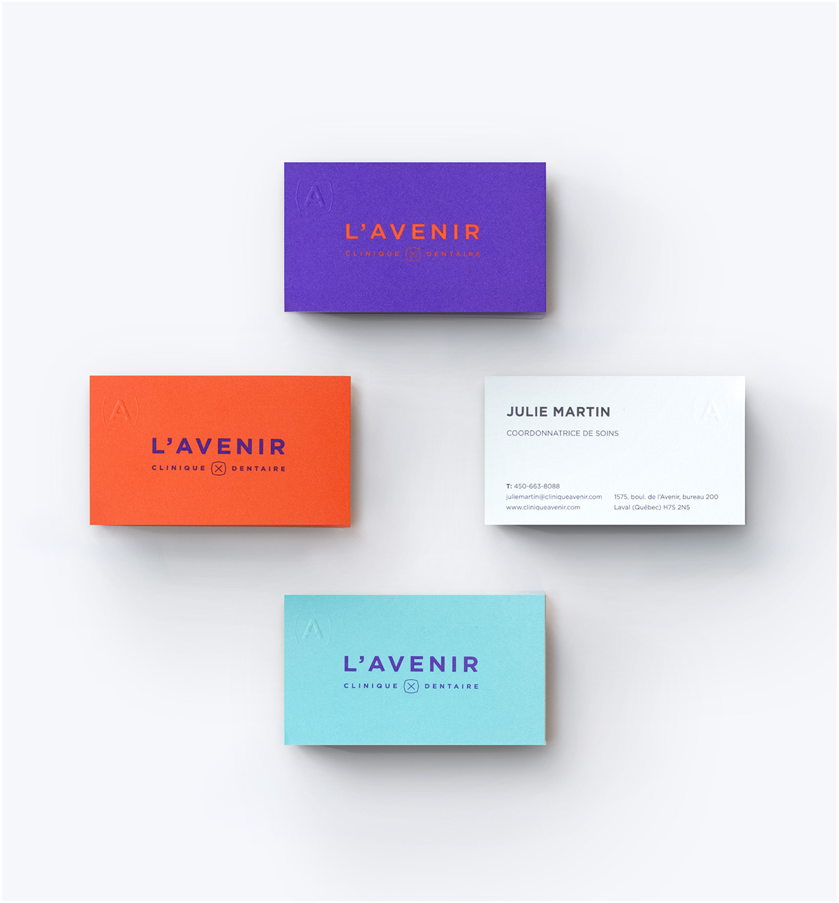
Phoenix took care of their website, branding, stationery & photos as well as the editorial work. The logo developed is simple & readable, showing a few subtle references to the dental universe.
The photographs bring portray the purity of white as a metaphor for the perfection that every dentist seeks to achieve. However, in order to bring the twist our client was looking for, we chose to photograph everyday elements to demonstrate what “life in white” might look like.
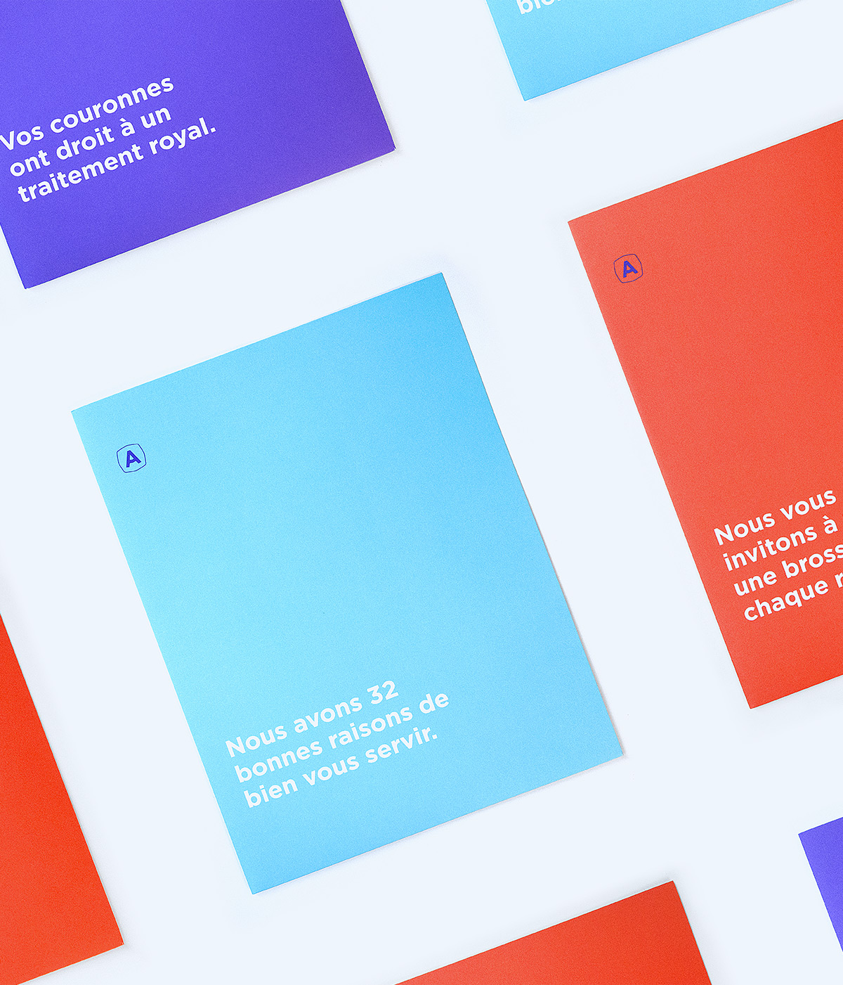
We chose a bright and original color palette of turquoise, orange and mauve, which stands out from the conventional visual codes of the industry.


