Human language is shown in so many artifacts of visual expression that many of the messages they want to communicate to us influence us unconsciously. Letters, characters, symbols, numbers - it is clear that written language can work and offer us infinite possibilities to establish communication.
But there is a common factor that influences our subconscious: the shape. A text is composed of content and form, typography should be the most appropriate vehicle to transfer us to that content.
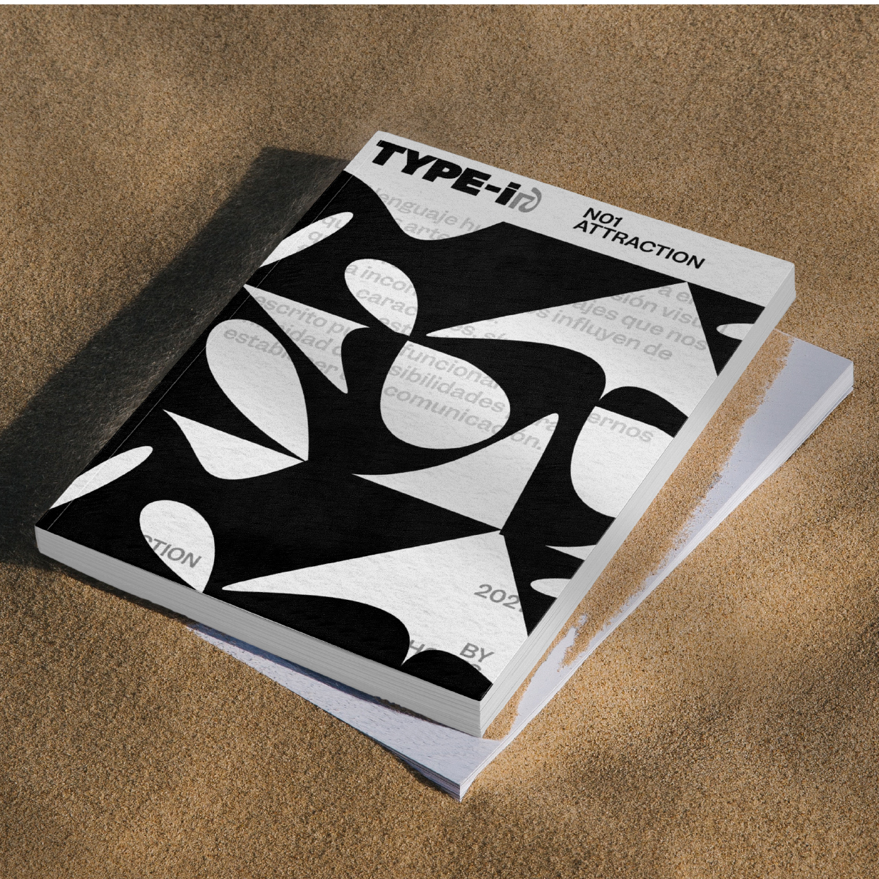
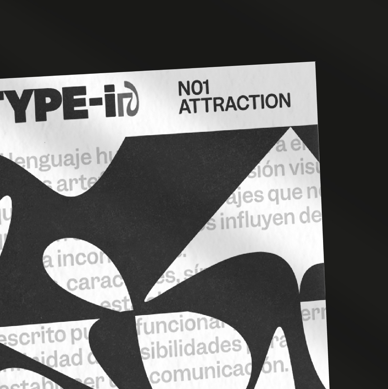
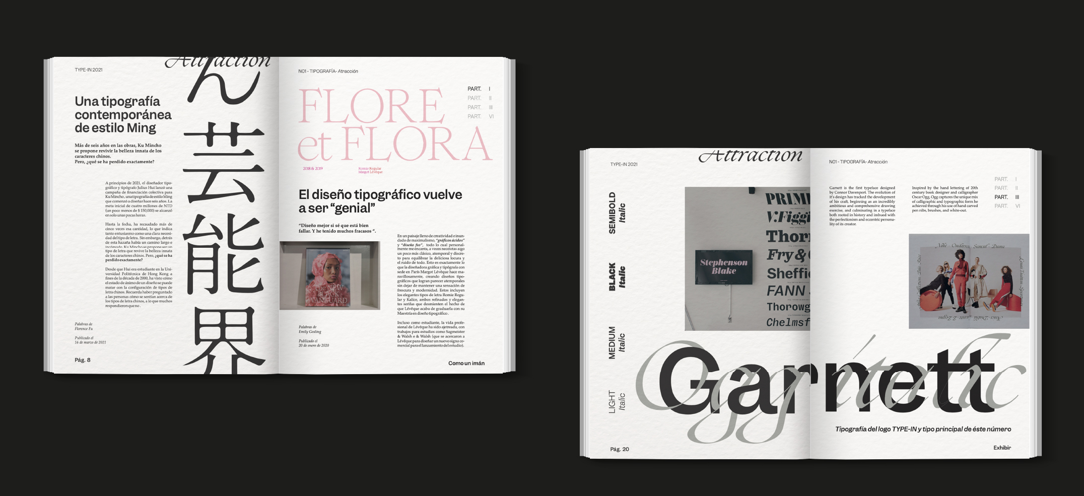
Type-In is a magazine that deals with typography from its form and analyzes its influence on users. Each number will do it from a very different approach or perspective, in this case the concept is attraction.
Its emotional and abstract approach is what characterizes the magazine and its content. "Attraction" raises and analyzes that subconscious influence in the way that makes some projects or fonts attract our attention or attract us despite not being of our style or taste.
All this, through articles and projects that offer us different approaches and points of view of the same concept. Due to its attractive colors and shapes, nature has always been a source of inspiration for art and design.
Hence, it has become a basis for a communicative approach, and it is clear that typography not only communicates linguistically, but also through its forms or “attractive part”.


