

Saturday 21 November 2020

16:30h

Yarza Twins is an award-winning London-based design studio run by Eva & Marta Yarza.
At Yarza Twins, we work with passionate clients to create honest work that stands out from the crowd. We build long-standing business relationships and help our clients find their voice and connect with their audiences.
Born in Spain, we have a wide experience working in Madrid, New York and London, where we are currently based. This wide international experience has allowed us to gain knowledge and to see things from different perspectives.
Among our design achievements, we have been awarded a prestigious D&AD Pencil in Packaging Design 2018 and we have also been selected as 1 of the 15 most exciting designers under 30 by Print Magazine (2016).
We believe that design is in constant evolution and that is why we are continuously learning. For us, design is finding the individuality of each business and translating it into a striking visual language, putting creativity at the center of our process.
As a small design studio, we deal directly with our clients, we love face-to-face conversations in which to evolve ideas and concepts. We bring to the table a unique team of individuals who are the best in their field, so that every project becomes its best. We want people to notice design, we want to inspire, we want to strike people’s imagination, we want to create a dialogue with your audiences, but above all, we want to create visible design so that your business doesn’t become invisible.
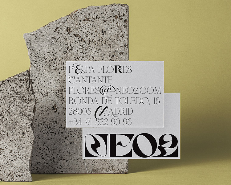
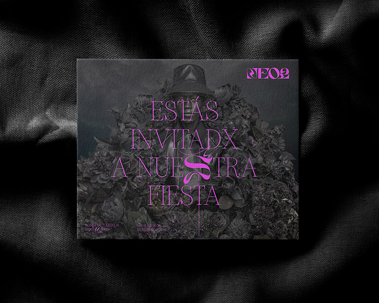
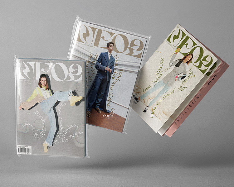
Neo2's - Goal is to share with the whole world the latest trends created in Spain and it was a great challenge to translate its 25 years of history through a disruptive design that reflected the imagination of the wide range of Spanish creators.
The redesign included the logo as well as the brand manual for the entire magazine. The logo represents the fluidity of the arts and how they gradually evolve over time, like a river, in constant and slow movement.
The first redesigned issue was published in September 2018, and in January 2019, following their concept of annual brand re-design, we had the opportunity to add new fonts and rules.
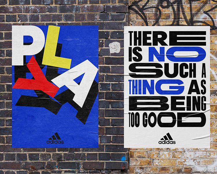
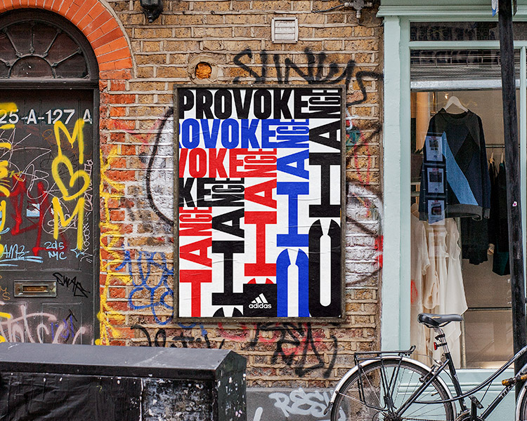
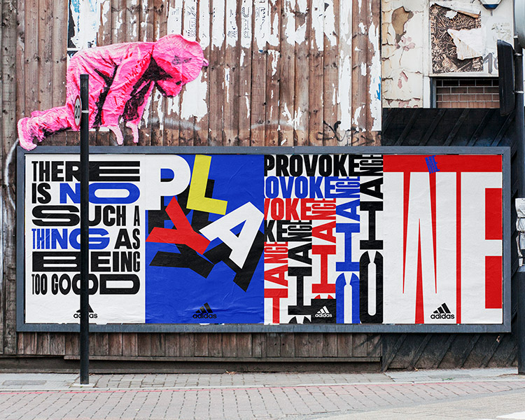
Adidas - This is a selection of posters for Adidas on the occasion of the Worldcup. Adidas sent us their new typography and corporate colours and asked us to make typographic posters with them. We created a series of inspiring phrases in line with the brand's language and transformed their brand elements to make them more exciting, while respecting the rules.
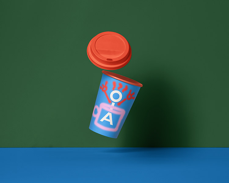
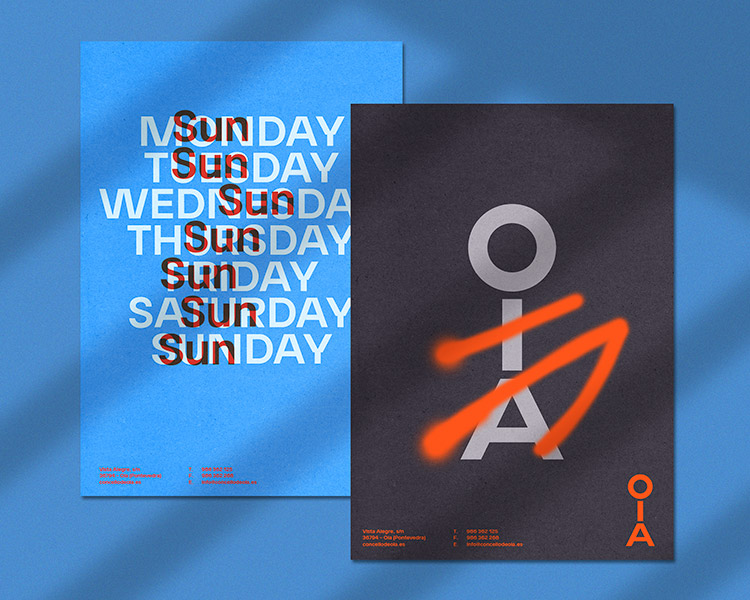
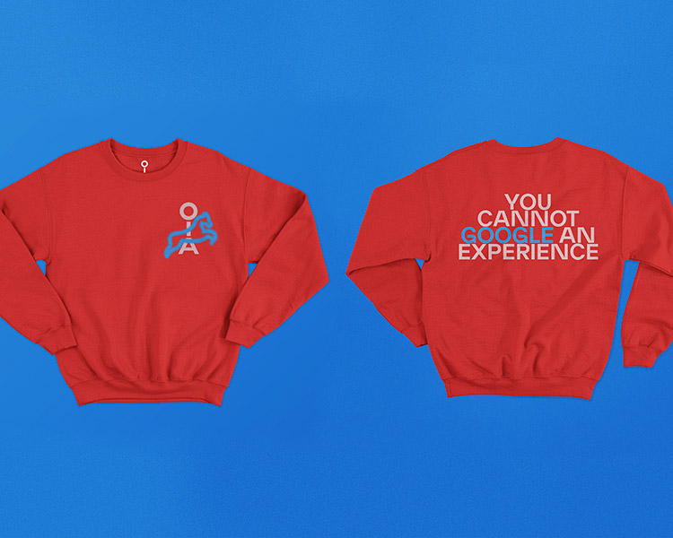
Oia - Is a paradisiacal town on the Galician coast (Spain). Located in a mountain with surprising views to the Atlantic Ocean, this zone of Spain stands out by its beauty, its food, its beaches, but mainly, because it has not been discovered by tourists.
The 'Concello local' (town hall) contacted us to do a brand redesign of the village. When we started to work on it, we wanted to emphasize that anyone can be part of Oia when visiting it, so we created a 'monigote' composed of the letters Oia.
The texts of the brand are based on the concept of contrasting with iconic copywriting from big cities around the world, adapting them to a place that allows you to disconnect from a hectic life.
This brand was quite risky, but it was welcomed with open arms by the local citizens. The local trekking club sold out the T-shirts with the logo in the first week, many businesses asked to adapt it to their disciplines and artists like Flix reinterpreted it in the murals that appear in the town.