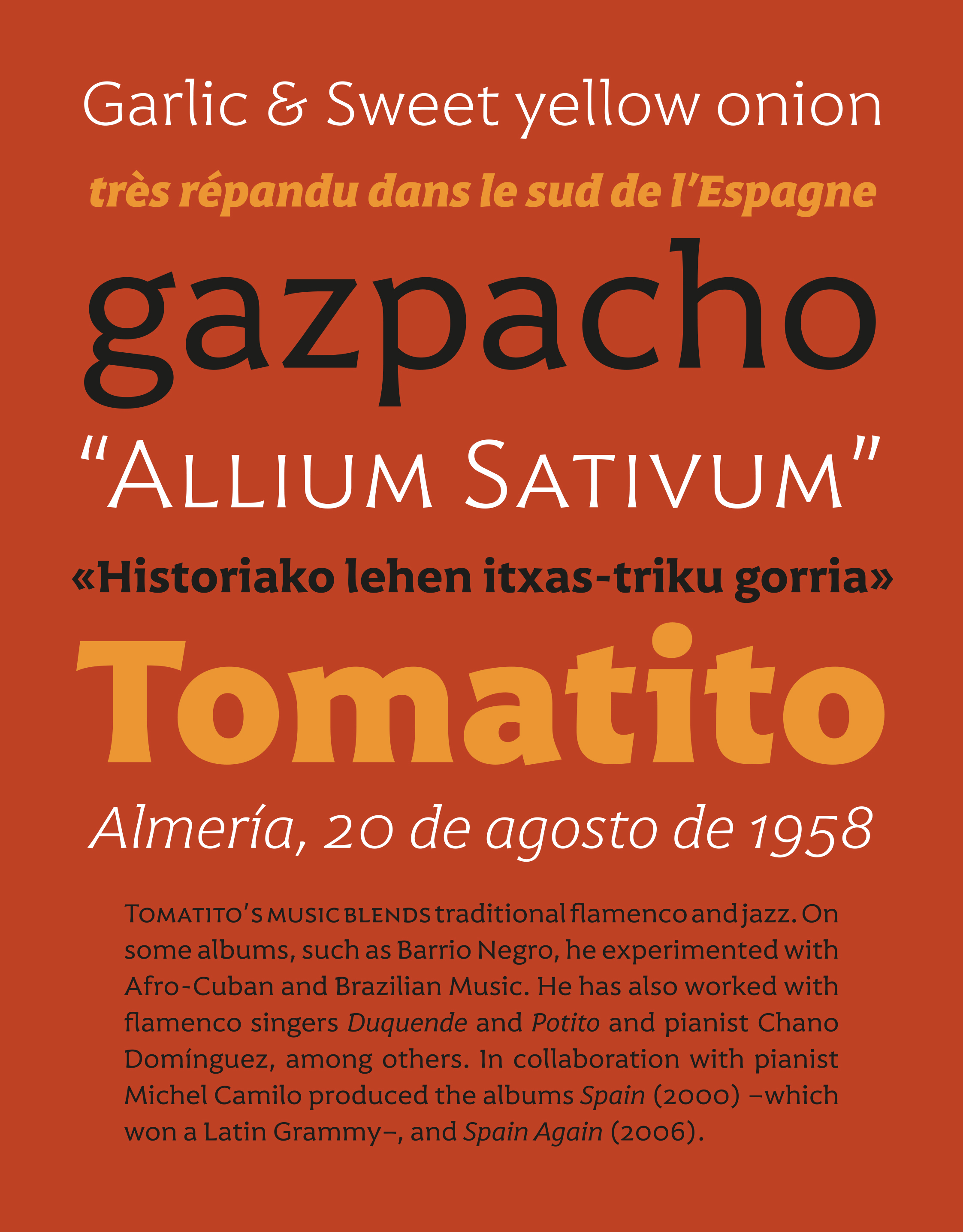
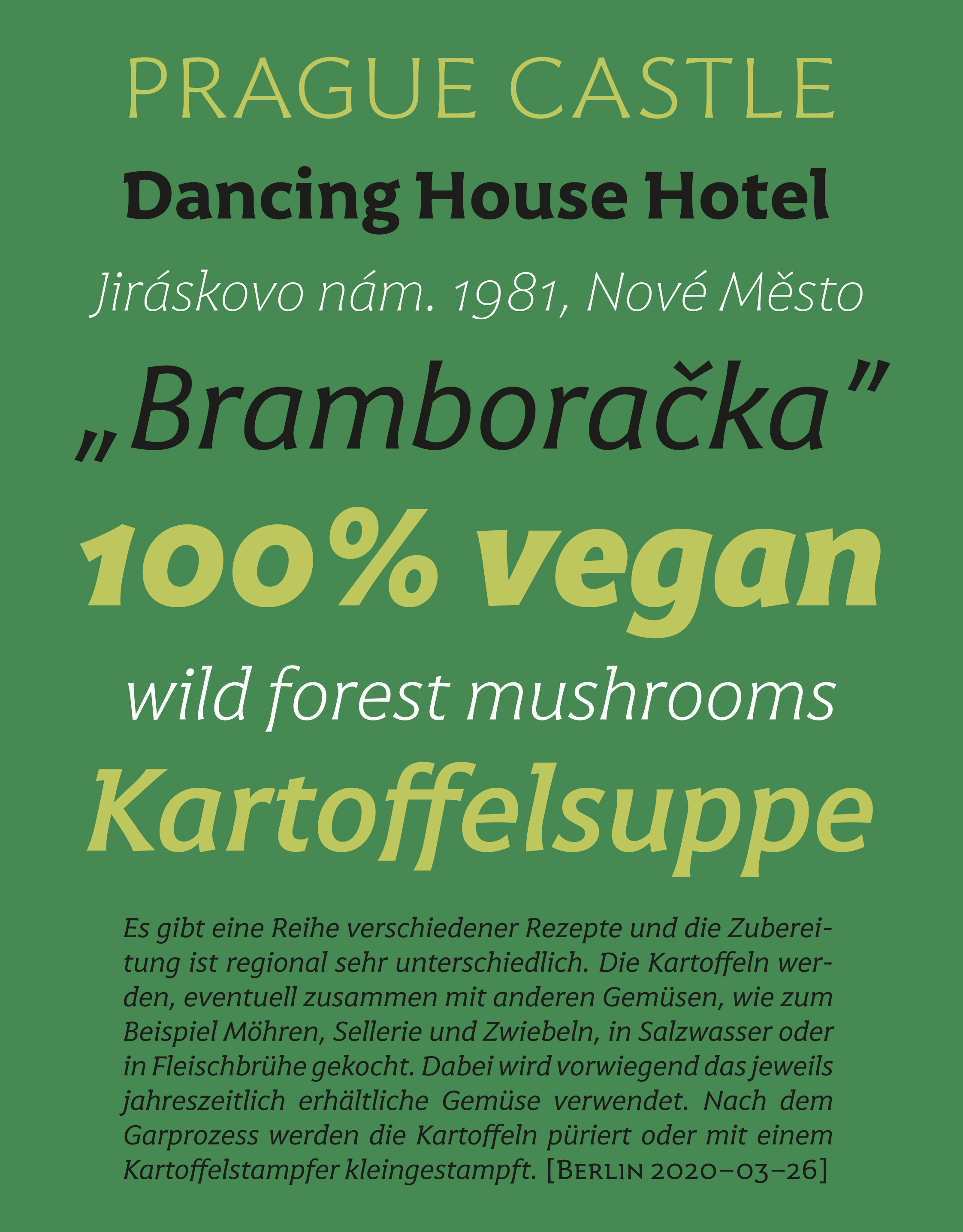
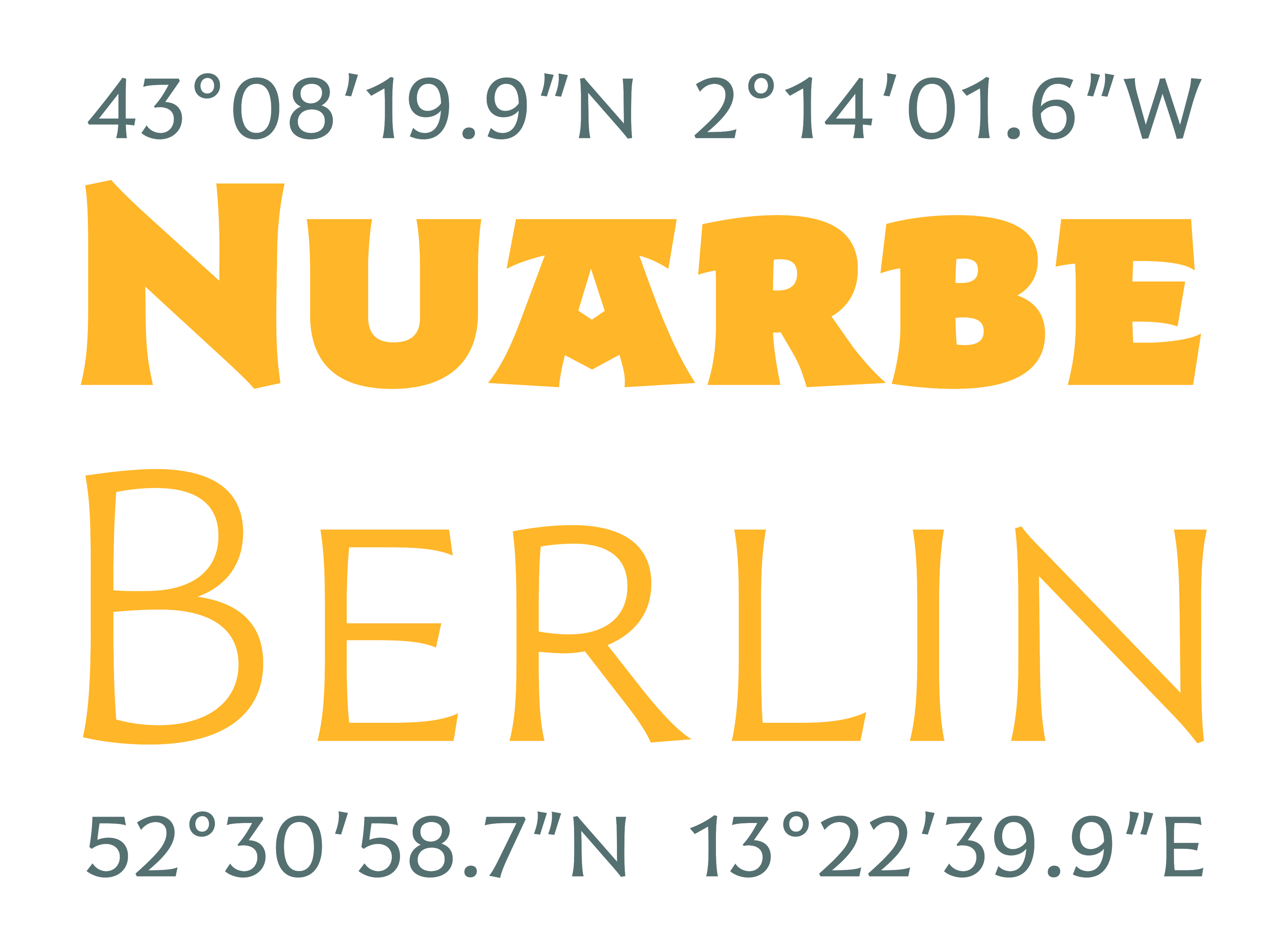
Harri Text is more than an extension of Harri Display. It shares its origin, a certain flavour and a great deal of its idiosyncrasies, but while Harri Display is an uppercase-only typeface intended for display uses, Harri Text is conceived as a text type family, including a new extra-light weight, italics, small caps and other additions that make it suitable for editorial purposes.
As its predecessor Harri Text addresses several concerns regarding the dualism neutrality vs. idiosyncrasy, or in other words, how local features meet global design in the context of a modern society (as is the case in the Basque Country in recent times).
There are several resources in Harri which allow anyone to find their ideal solution in this regard, either emphasizing its idiosyncrasies or toning them down so that a more neutral result is achieved.


