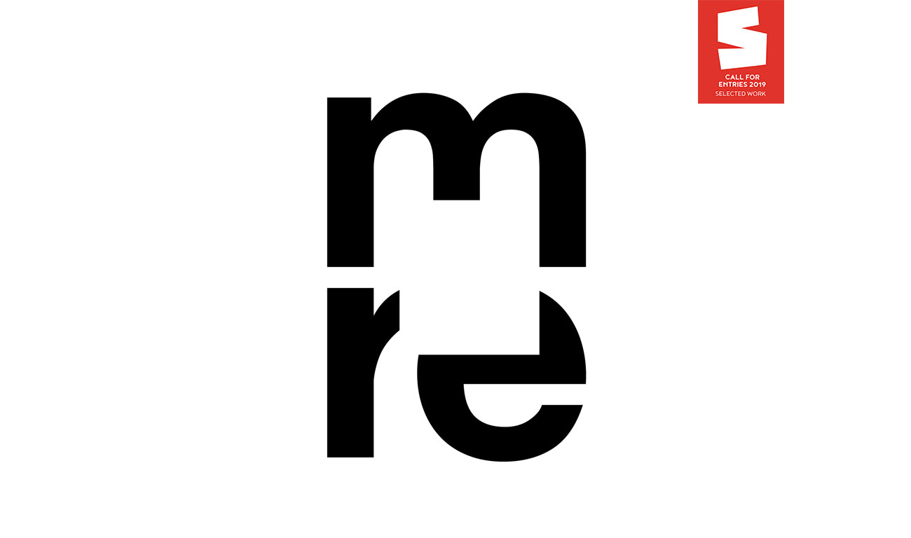
Logotype for the Museum Reinhard Ernst, a museum displaying abstract art. Three thoughts guided our creation of the identity:
· Because abstraction is the process of omitting parts or elements, we cut out a portion of the letter forms in the acronym.
· The museum’s building, designed by famous Japanese architect Fumihiko Maki, is based on a distinctive concept: Viewed from from above, the building’s plan reveals that a large square atrium is cut out of the building corpus.
· The square open space symbolizes paintings or works of art that will be displayed in the museum. It also conveys a sense of the mental openness that we practice while contemplating abstract art.
Three letters combine to form an emblematic, recognizable and stable shape. The letterforms are arranged in a meaningful hierarchy: Under the sheltering M (for museum), the letters R and E (for Reinhard Ernst) stand next to each other to create a compact body.
Despite the cut-out abstraction, the letters are still legible. The mind of the viewer adds the missing parts.


