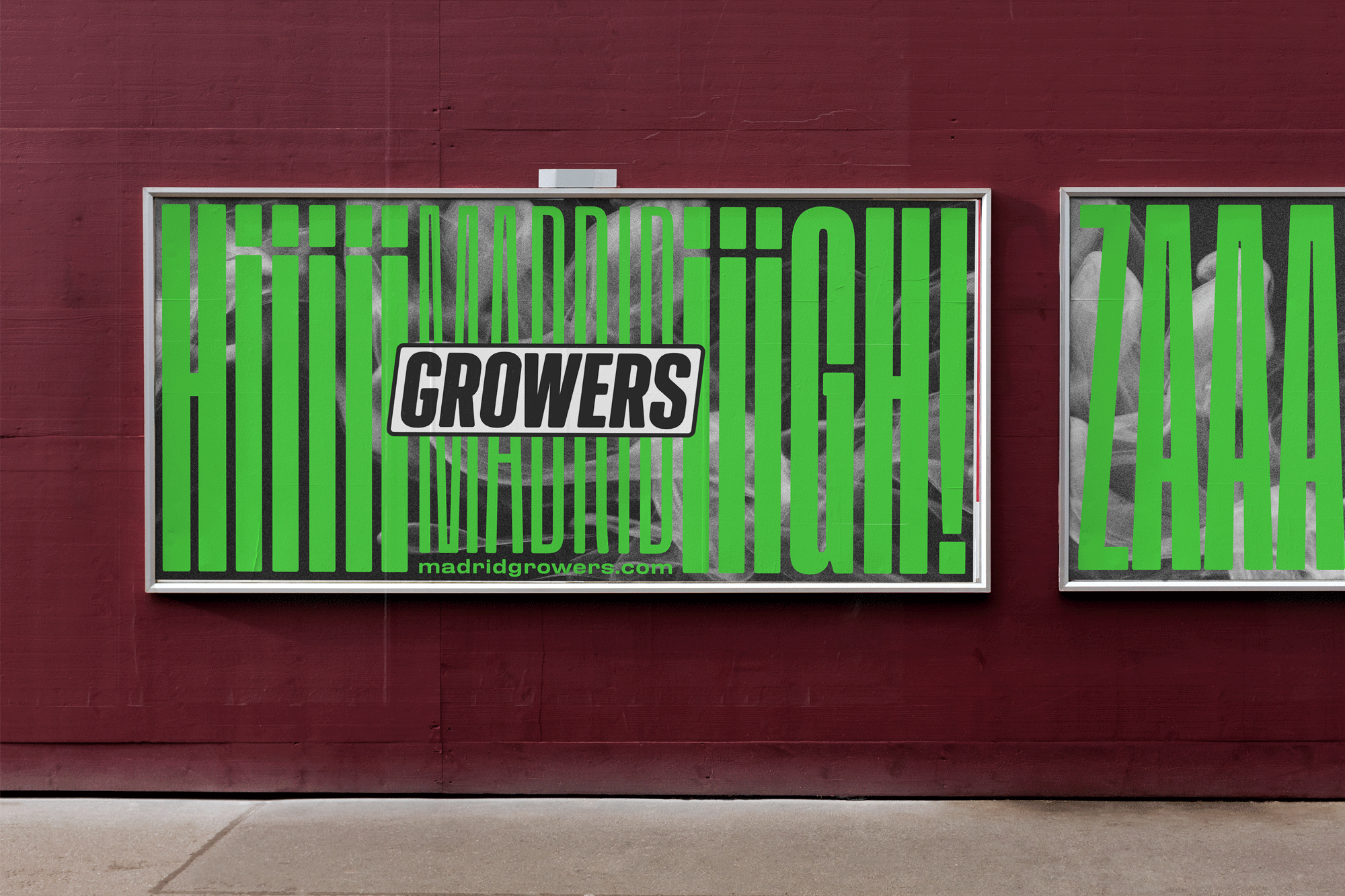
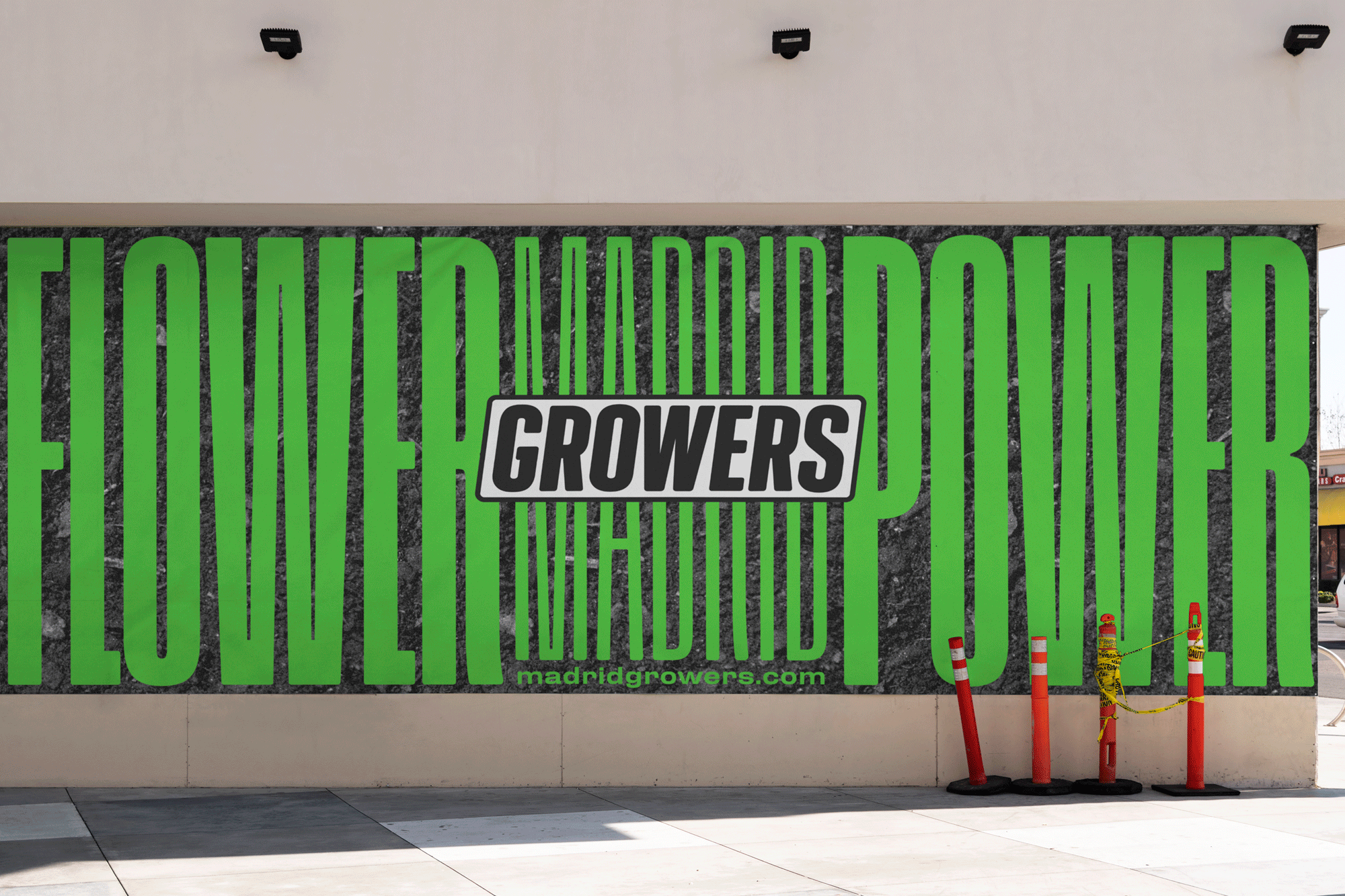
Madrid Growers is a growshop in the south of Madrid. They sell everything that you want in terms of growing. The project was planned around the idea of They are in love of them work.
They love it as much as they are mad. This logo is about his flower pot and the flowers who grow over it. The visual identity explains their kind of work and how their clients are about his products.
The color palette is always in 2 colors, green fluor and black so this green is always powerful. Art direction is based in the idea of the pictures of smoke and big type over it.
We make in the picture a gaussian blur effect which gives the pic a little bit more of madness. The type that we used is based in the madness idea too. We set a big bold condensed type besides an extended medium new grotesque type.


