Querido Salvador, querido Lorquito is an epistolary, a book full of love letters between Salvador Dalí and Federico García Lorca. The briefing for this project asked for the reedition of an already published book, but with a new concept behind it.
I chose "Querido Salvador, Querido Lorquito" by Víctor Fernández and Rafael Santos Torroella, as I'm invested in both Lorca's literature and his life and relationship with Salvador Dalí.
I think it's one of the most interesting relationships between artists in the 20th century, which the book captures perfectly. What do you feel when you receive a letter? For me, the feelings I find most prominent in this action are tension ("What's inside the letter?"), emotion ("Wow, the other person sat down, picked up a pen and paper, wrote all of this.
just so I could read it!) and intimacy (the letter is sealed so only the recipient can know what's inside). I tried to convey these three emotions through the format and design of the book.
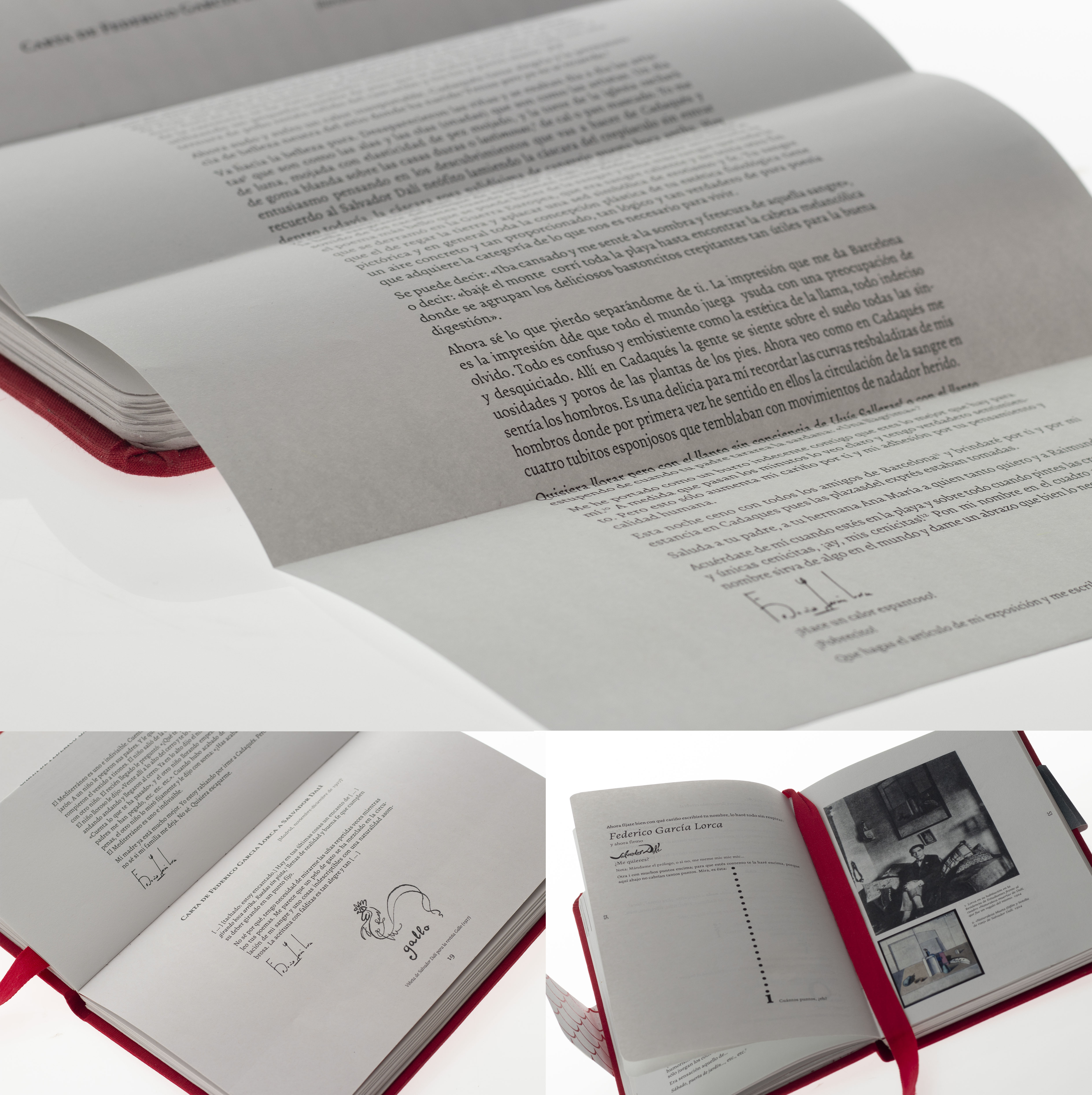
The dimensions are based on a personal journal, to convey the feeling of intimacy, as it's inherently something very personal. Some of the letters inside the book are folded, which I feel conveys the feeling of tension, as you have to manually unfold them to know what the letter says.
The colour of the book is red, which is a very emotional colour, and goes well with the feeling of intimacy as well. The personality of the artists is reflected on the book as well—the format itself changes depending on which of the two artists you're reading.
When it's a letter from Dalí, the format is horizontal, as Dalí's madness is very visual and you don't need to do much else other than look at what he draws in the letters to understand it.
On the other hand, Lorca's madness is much more subtle—Lorca is a writer and a poet, and, even though his drawings are present on the book as well, I wanted to give his writing much more importance.
The way I did this was by changing the format of his letters: the format is vertical and you have to flip the book to actually read them. Having to interact with the book to read what's in it makes you more invested in what the text says.
I played with the typography as well, to give the book more of a manuscript feel. Not all the characters are the same when you're writing a letter, so some of the characters in Dalí's letters are manually distorted.
I also played with the different thicknesses of the typeface, and used them semantically. Project tutored by Juliana Javaloy for the Editorial Design Projects class at EASD València, in the spring semester of 2018.
The original book by Víctor Fernández and Rafael Santos Torroella was published by Elba in Spain in 2013.


