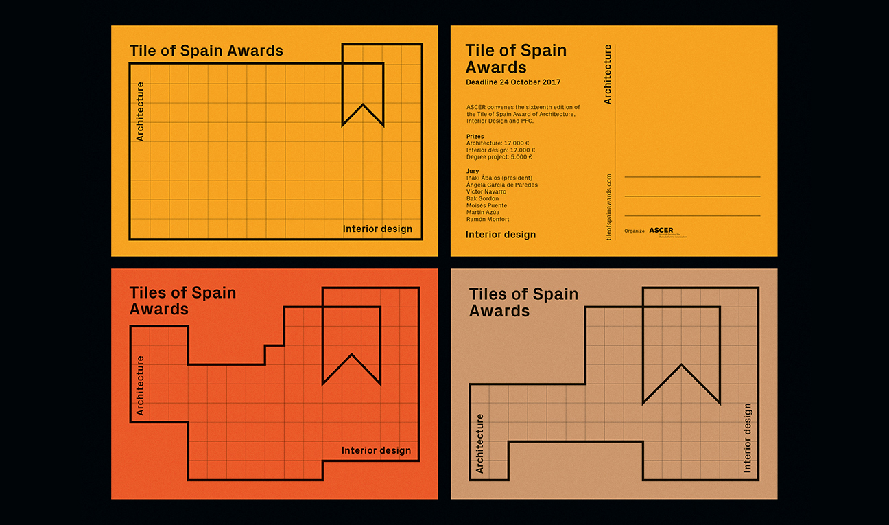
Logotype and visual identity redesign for the Tile of Spain Awards, an International Award for Architecture and Interior Design in Ceramics. We propose a logotype and visual identity system that represents a plane of a building with the form of an emblem to represent a prize.
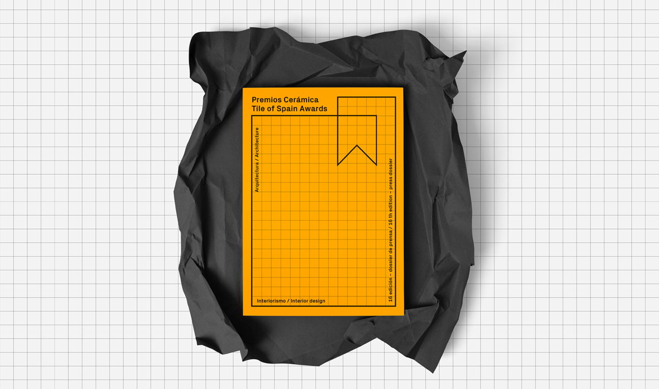
The graphical supports are accompanied with a grid that simulates ceramic pavements. The versatility of the flexible system allows us change every year the graph without losing the identity.
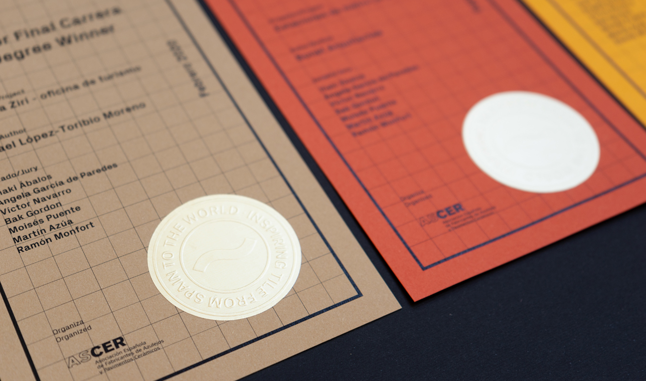
For all the print communication we choose high quality papers with colours related to the ceramic material, printed in black and white ink, reinforcing the idea of giving importance to the material.
The typography PX Grotesk used, combines formal solutions of the squared pattern of pixels and the mechanical drawing, and it’s designed for screen and printing, something that allows a great legibility in small sizes and also works perfectly in holders with a particular and round aesthetic.
It is a font that combines science and art, like it happens with the architecture and the interior design. The restyling has supposed a radical change with the previous identity and It has duplicated the number of offers presented in previous editions.


