Nowadays, all over the world, there is an excess of ultra-processed foods in our diets, which leads a great part of society to have bad eating habits. Furthermore, normally, the labelling of this type of food is basically based on a commercial aspect that tries to persuade the consumer to buy it, even lying to the potential buyers with slogans and other marketing techniques.
This type of packaging is problematic mostly at the time of choosing breakfasts or mid-morning and afternoon snacks, because in those moments there is less reflection on the quality of what is eaten, as it is not a fixed meal such as lunch or supper.
Arrel was created by a chef born in south Catalonia, who, influenced by her grandmother’s cooking, went to culinary school and decided to open her own store to encourage the consumption of healthy food, just like what she learnt to cook when she was young, without sugar or additives, everything natural, how it was made in the past.
Arrel, the Catalan word for root (raíz in Spanish, both come from the Latin word radix), is not only used in that sense. It also means origin, resource and firm ground, and thanks to its polysemy this word has been related to the company’s philosophy.
The main objective of this project is to encourage healthy high-quality food, made with local products, cooked just how it was made in the past, without added sugars or chemicals, with ecofriendly containers that can be refilled.
The label is simple and direct, showing only what the product contains, to show a sincere, transparent and trustworthy brand. Its products are aimed at everyone who wants to eat healthily at punctual moments throughout the day, without taking into account the age or the sex of the consumer.
For the conceptual part of the label, the data visualization theory was used, since this discipline is based on the creation and the study of visual representations of data and its main aim is to communicate information clearly and efficiently.
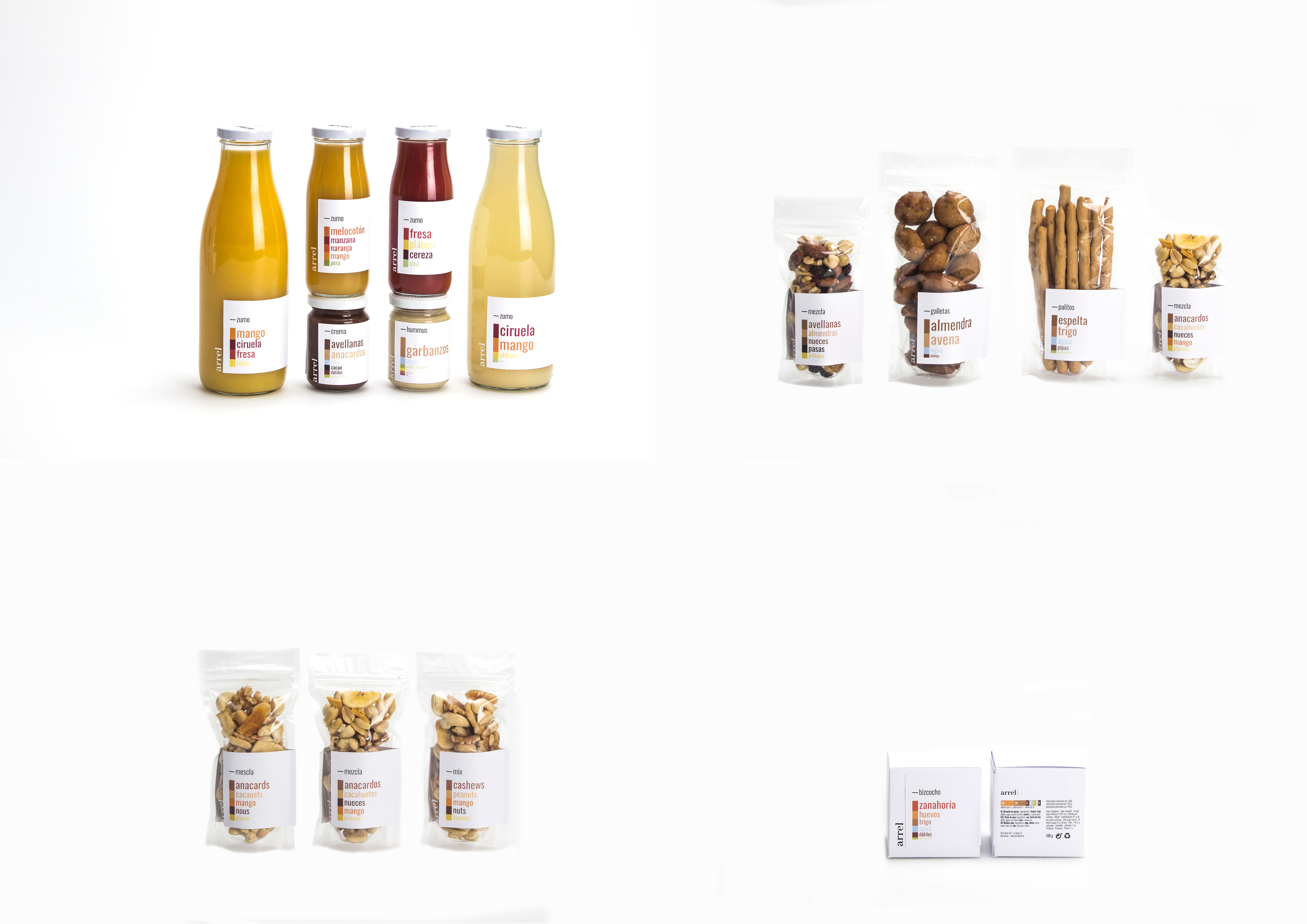
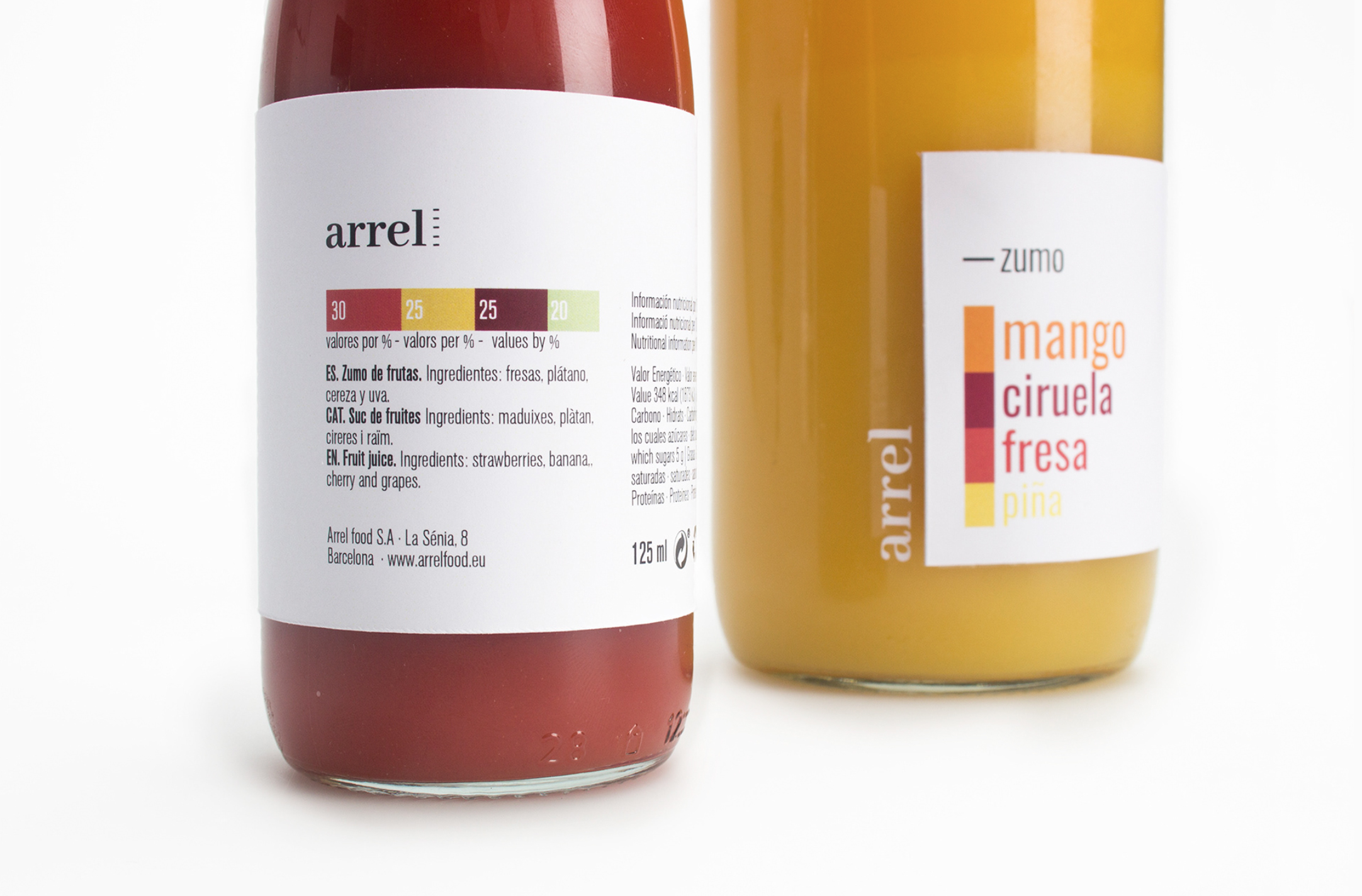
Certain products’ recipes were made, and with the percentages of each ingredient in the products, the stacked bar charts in the labels were created. A column with color blocks, in which the ingredients are arranged according to the quantity used in the recipe (from top to bottom, from the largest to the smallest quantity) and with a typography on the right side.
The size of the typography is decided according to the size of each block on the column (i. e. the percentage of each ingredient), and the color corresponds to the original one of each ingredient.
These typographies can be translated to other languages in case that the brand opens new stores, depending on the area and the type of clients. The labels created for this brand are die-cut in three sizes, which adapt to every container in the assortment.
It is a semi wrap-around label, and on the left side there is the product’s name and, on the bottom section, there’s the chart previously described. On the right side, there is the brand’s name, with a small horizontal representation of the same chart with a small number above each color block, which indicates the proportional amount of that ingredient in the final product.
There is also the ingredients’ information written in three languages: Spanish, Catalan and English, just as the product’s nutritional value and weight, and the company’s information.
The expiration date will be inked by hand on the label with a dater stamp after the container is filled. On a structural level, there are two types of bottles, with a capacity of 250 ml and 750 ml, both reusable and made of crystal, and their mouths have the same diameter, so the lids are interchangeable.
The shop has a refill system for the juice bottles, but the consumer can also reuse them at home. The Ziplock bags, that also come in two different sizes, were thought for an on-the-go consumption, reusable and made of PLA, which makes them biodegradable.
The box is a recyclable folding carton. The labels are made of recycled paper and printed with water-based ink and glued by hand in these three structures using a glue made of casein.
On the lid and the side of the bottle and on the side of the Ziplock bag, there is the brand’s name silk-screen printed in black and white. On top of this, these products have a two secondary packaging options to take them home from the shop.
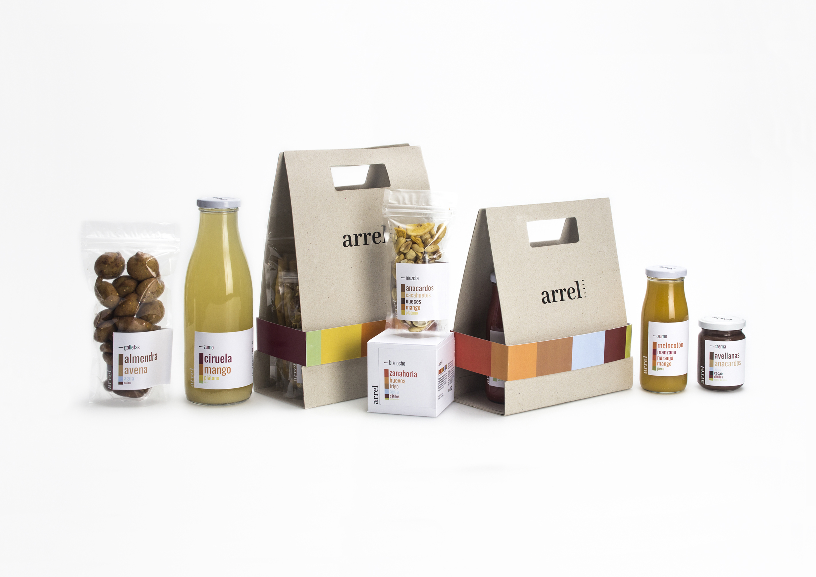
To transport several Ziplock bags, combined as the consumer wishes, the structure used is based on a cardboard handle folded on itself. This elongated structure of recycled rustic poster board with a slot in the middle and handles on the sides, with two small bottom die-cuts, is perfect to transport the products.
When the time to use it comes, it is folded in half and using some rivets located in the die-cuts, the Ziplock bags are riveted to the structure and can be carried comfortably thanks to the handles.
Moreover, there are also two sizes of shopping bags, created with the same material as the previous structure. This new structure is divided in three parts, two exteriors which are identical reflections of each other with a handle on top of them, and a flat rectangular section in the middle.
At the moment of assembling the bag, the products are put in the middle section and the sides of the structure are lifted. A narrow band of the corporative colors is situated around the exterior of the structure, to make holding it together easier and to prevent the products from slipping.
On the inside of the bag, there are the recipes of some products printed, so the consumer can give the bag a second life and also go on with the healthy eating philosophy, make the recipe and be encouraged to continue cooking.
Long live healthy real food!


