Don Perolete is a family business and artisan of chips located in Arcos de la Frontera (CĂĄdiz). Its name comes from the typical Perol, an oil with which chips were historically fried.
The objective was to create a communication strategy to sell their products to the international gourmet market, broadening the range and creating an original impact in the chips sector.
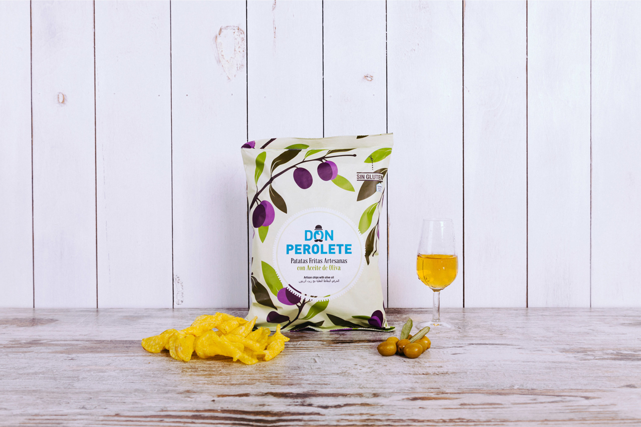
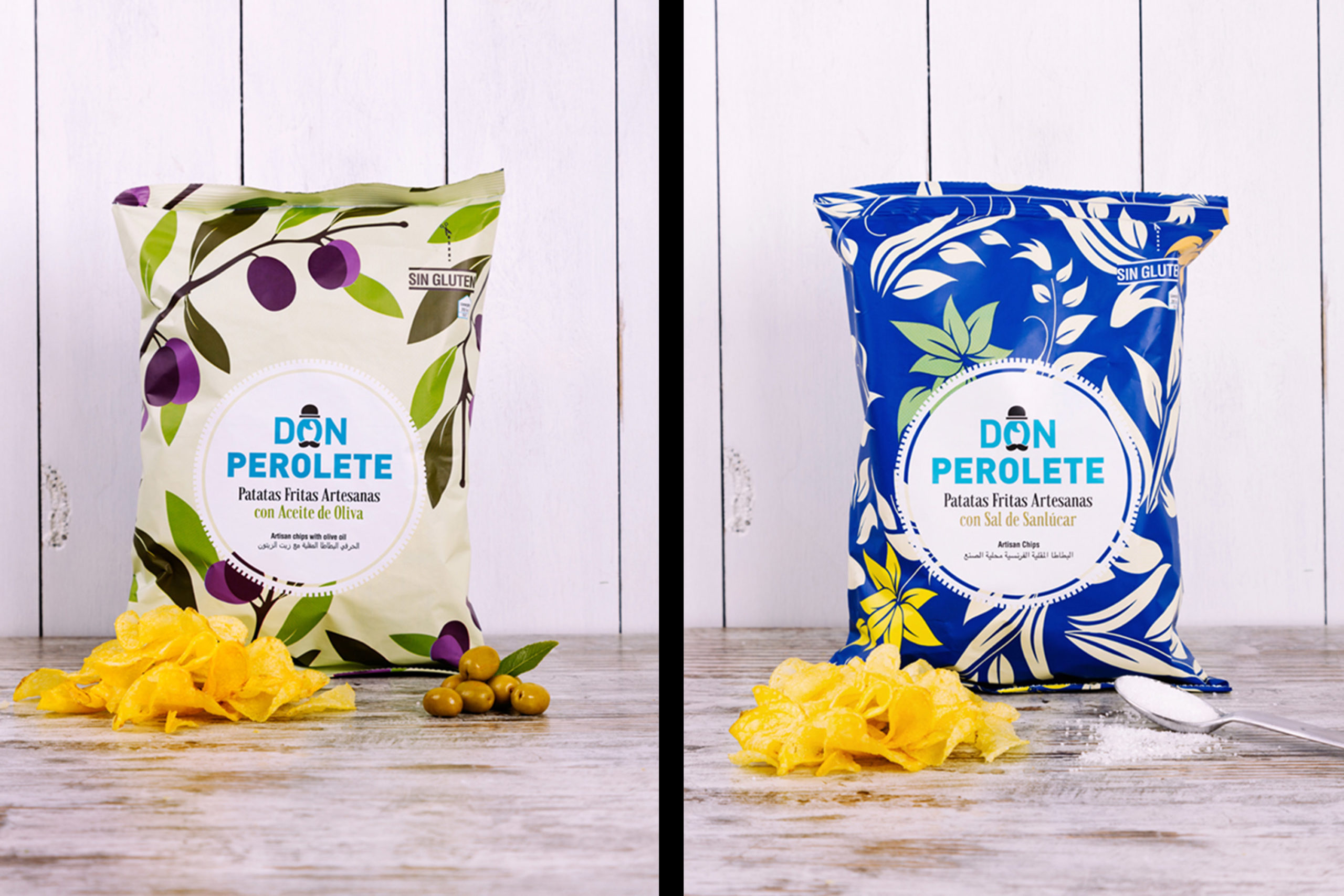
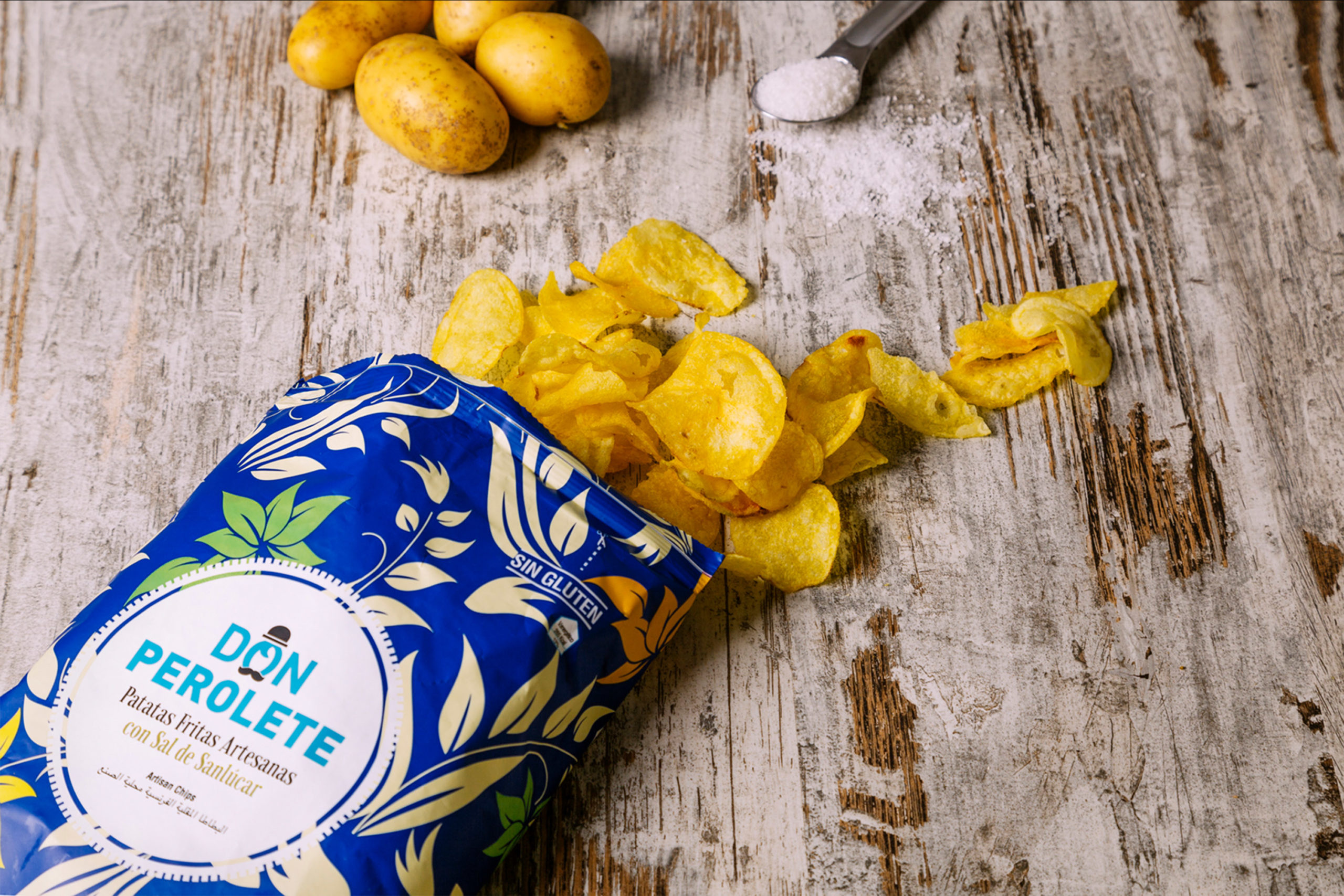
To do this, our task was to redesign the brand and to create a ground-breaking packaging line, under the values of craftsmanship, tradition and family. For the redesign, we chose to improve the logoâs impact; professionalizing and refining the typography, and eliminating childrenâs drawings to compete in the gourmet market.
For the tagline, we added the artisan value with a typography that reminds to the tradition, as opposed to the modern logoâs. As a complement to graphically support the packs, we decided to interpret William Morrisâ motives, adapting them to the new times in colour and shape and differentiating them by their elements.
The final product is a gift for the eye, and above all, for the palate.


