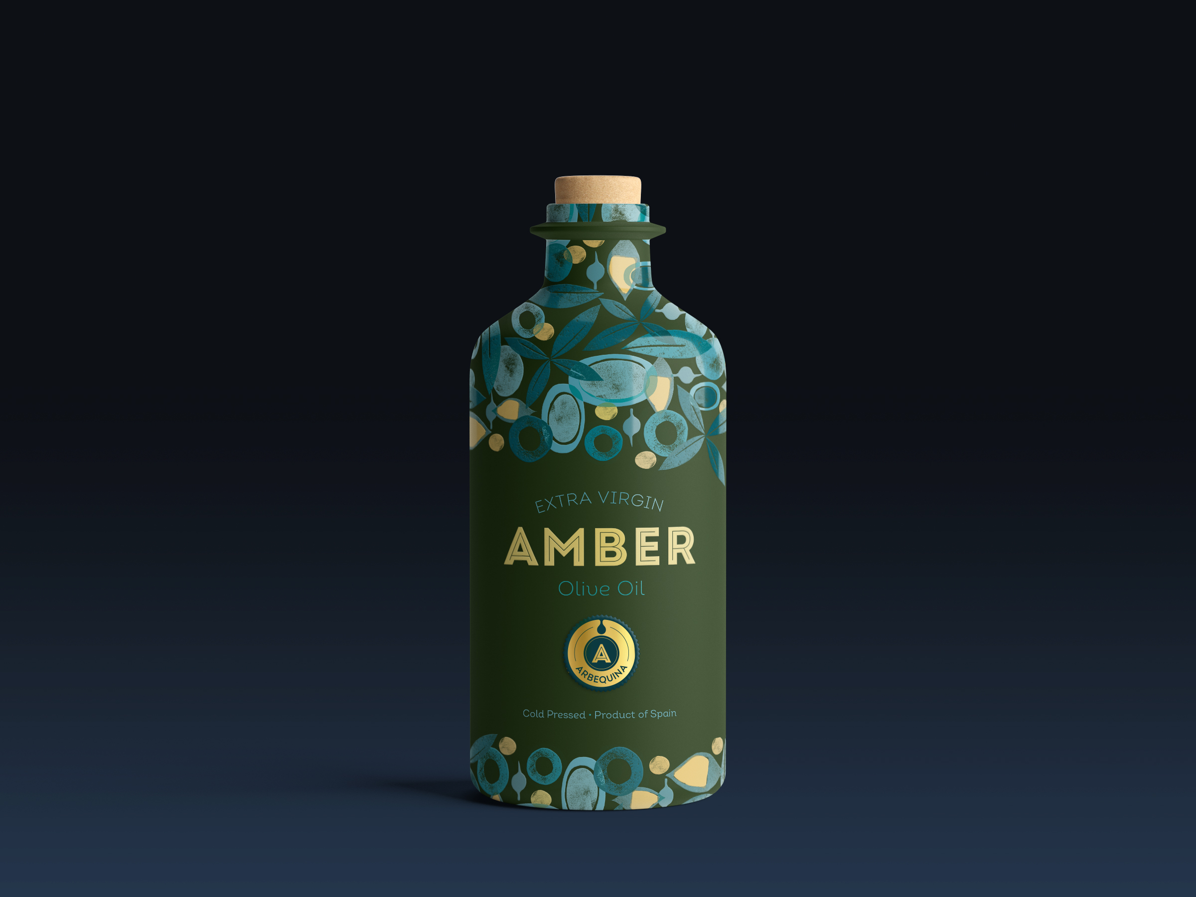
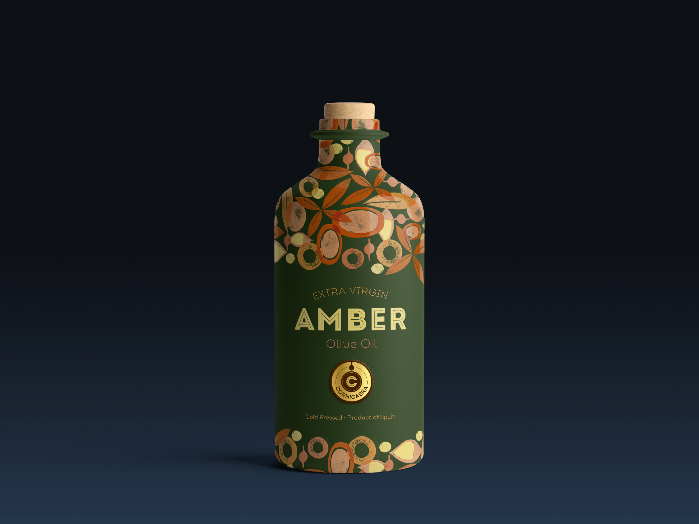
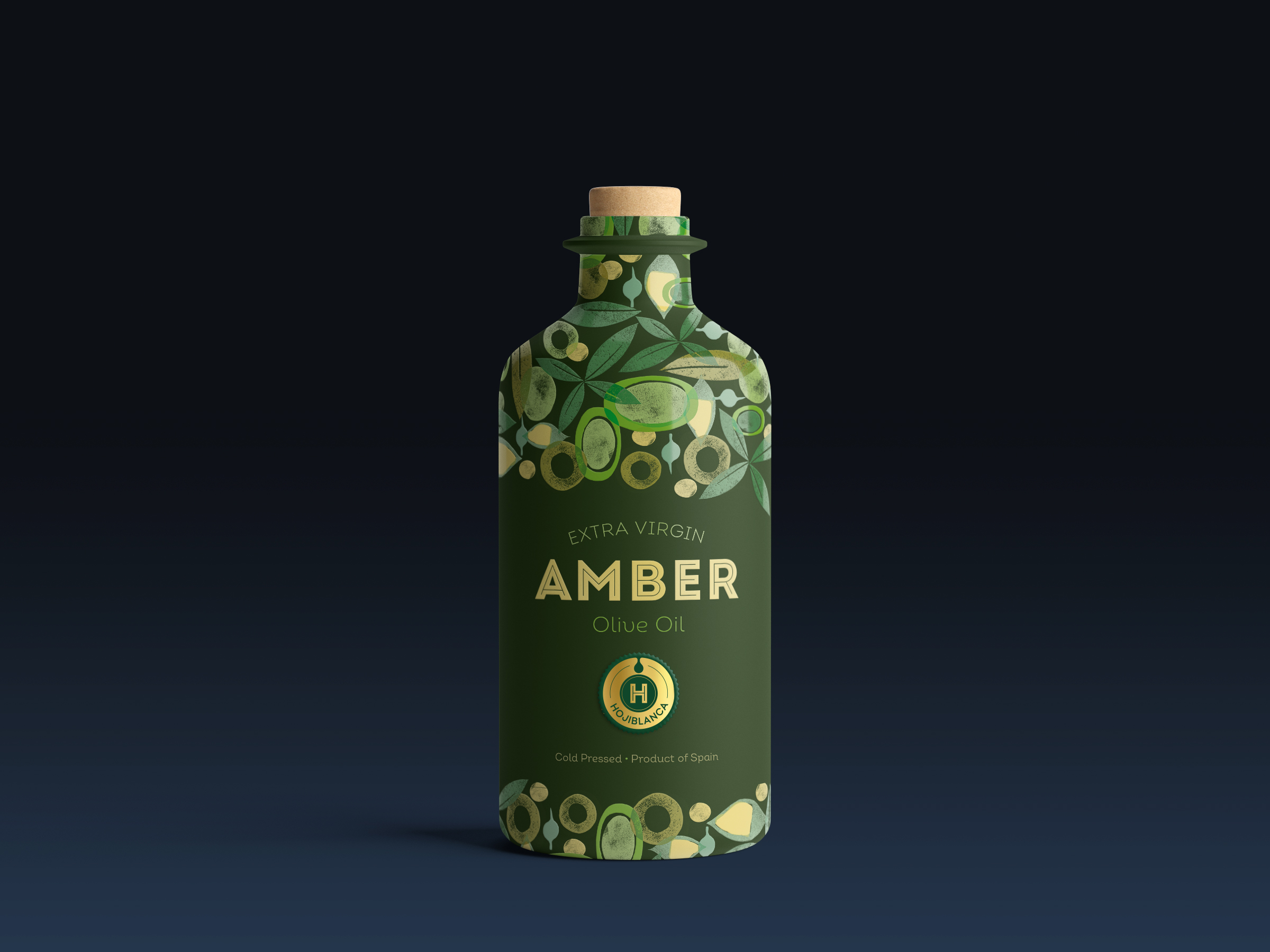
When Amber charged us with the design of their olive oil bottles, we decided to embark on the project with Studio Gudulab, a designer of manual prints specializing in food products which, as the designer herself comments, “are based on hand-carved stamps, creating prints that are sometimes based on natural elements and sometimes on abstracts, construing a very modern and unconventional result.”
For the design of our pack, we decided to carve olive leaves, olives and other elements associated with the world of olive oil. We based the guiding thread of the collection on the choice of two colours which feature in all three containers: yellow to evoke the olive oil, and dark green as a tint for the ceramic bottle to elegantly highlight all the elements featured on it.
We adjusted the colour palette by opting for different colour ranges for the three varieties of oil: orange for the Cornicabra, blue for the Arbequina, and green for the Hojiblanca.
In addition, to provide an element of contrast, we used a typeface family that is both simple yet full of subtle details, adding personality to the design of olive oil bottles without detracting from the print.


