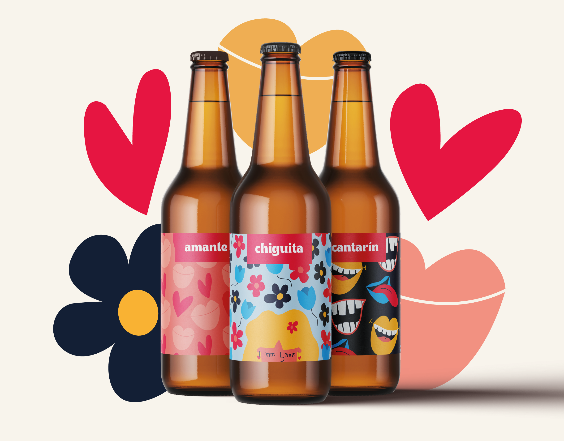
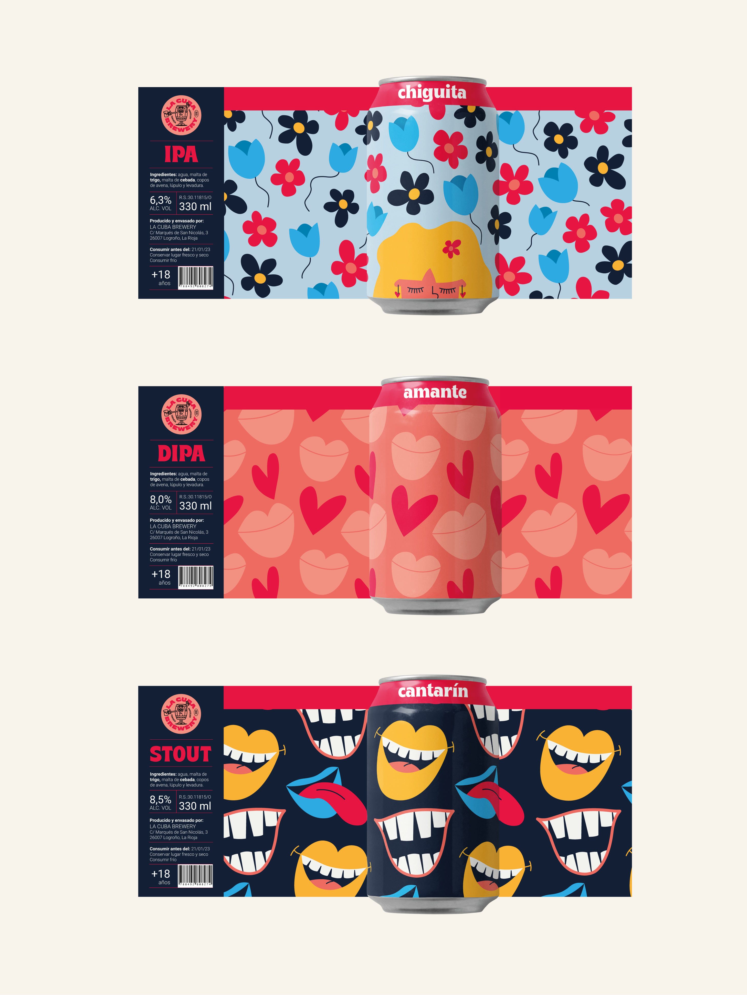
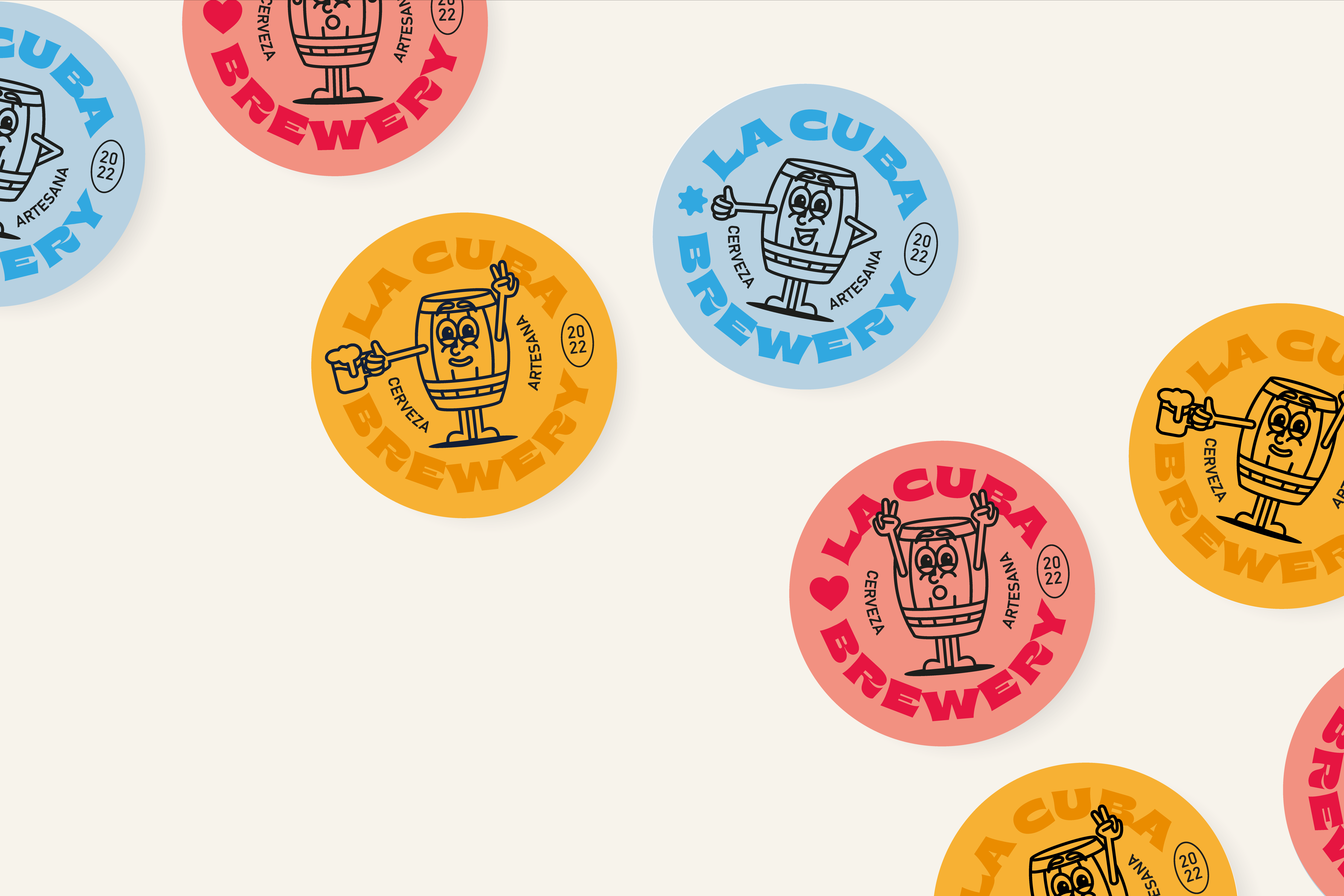
More and more companies are nowadays embracing the booming craft beer sector. In 2020 there were more than 3,500 different beers on the market, and 420 breweries with active production. However, breweries are not evenly spread across Spain: they are distributed by zones. La Rioja is one of the areas with the worst sales figures each year. For this reason, the main objective of this project has been to develop the complete visual identity of a new brand of craft beers based in La Rioja, which will boost sales and become a benchmark in the northern part of Spain. In this way, the graphic image has been adapted to the requirements of an increasingly demanding millennial target, resulting in an attractive and coherent visual identity. My aim was to create a brand with a distinctive Rioja name, alluding to its roots and identifying the product with its origin. To do this, I looked for specific vocabulary from La Rioja and related it in a mental map until I found the definitive name: ‘La Cuba’. A ‘cuba’ is a container made of pieces of wood or sheet metal, joined with metal hoops, which holds liquids such as water and wine. In La Rioja it is common to see ‘cubas’ as tables in bars. Therefore, selecting the word 'cuba' as the naming makes the brand memorable and easily identifiable at national level. All the beers also have a name that differentiates them and makes them unique: • Chiguita: it means 'girl' and it is the name given in La Rioja to young people by their elders a few years ago instead of their proper name. The label design features an illustration of a young girl with a calm expression, surrounded by flowers that allude to both the moment of life and the soft, fruity aromas of the IPA. • Amante: it means 'sweetheart'. In La Rioja it is used to affectionately ask how are you doing: ‘¿qué vida amante?’ The illustration is a pattern of hearts and mouths reflecting the definition. Unlike 'Chiguita', DIPA (Double IPA) has more intensity and body, so that the graphic design and colours are more intense. • Cantarín: it is said of the 'Riojan accent'. A high tone of voice with emphasis on the pronunciation of the syllables, a sign of identity. Mouths have been drawn with jovial expressions, as if it were a conversation between friends. It is the most daring and powerful illustration, attributes that it shares with the stout’s beer. The labels have been designed to be placed on beer cans, given that during the pandemic this format acquired many followers as beer consumption shifted from bars to homes. All the labels share the same flat and saturated colours. The designs are also applicable to beer bottles. The result is a highly competitive and easily implementable product in a market full of competitors. This project was made during my graphic design studies at the International University of La Rioja (UNIR), and it is a fictitious project.


