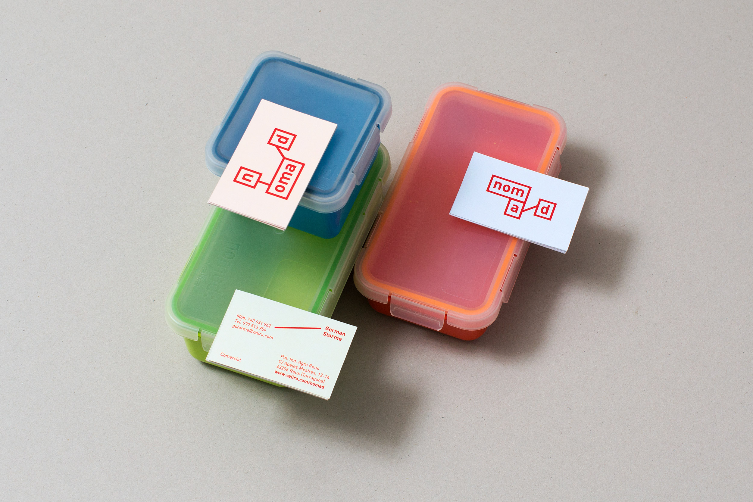
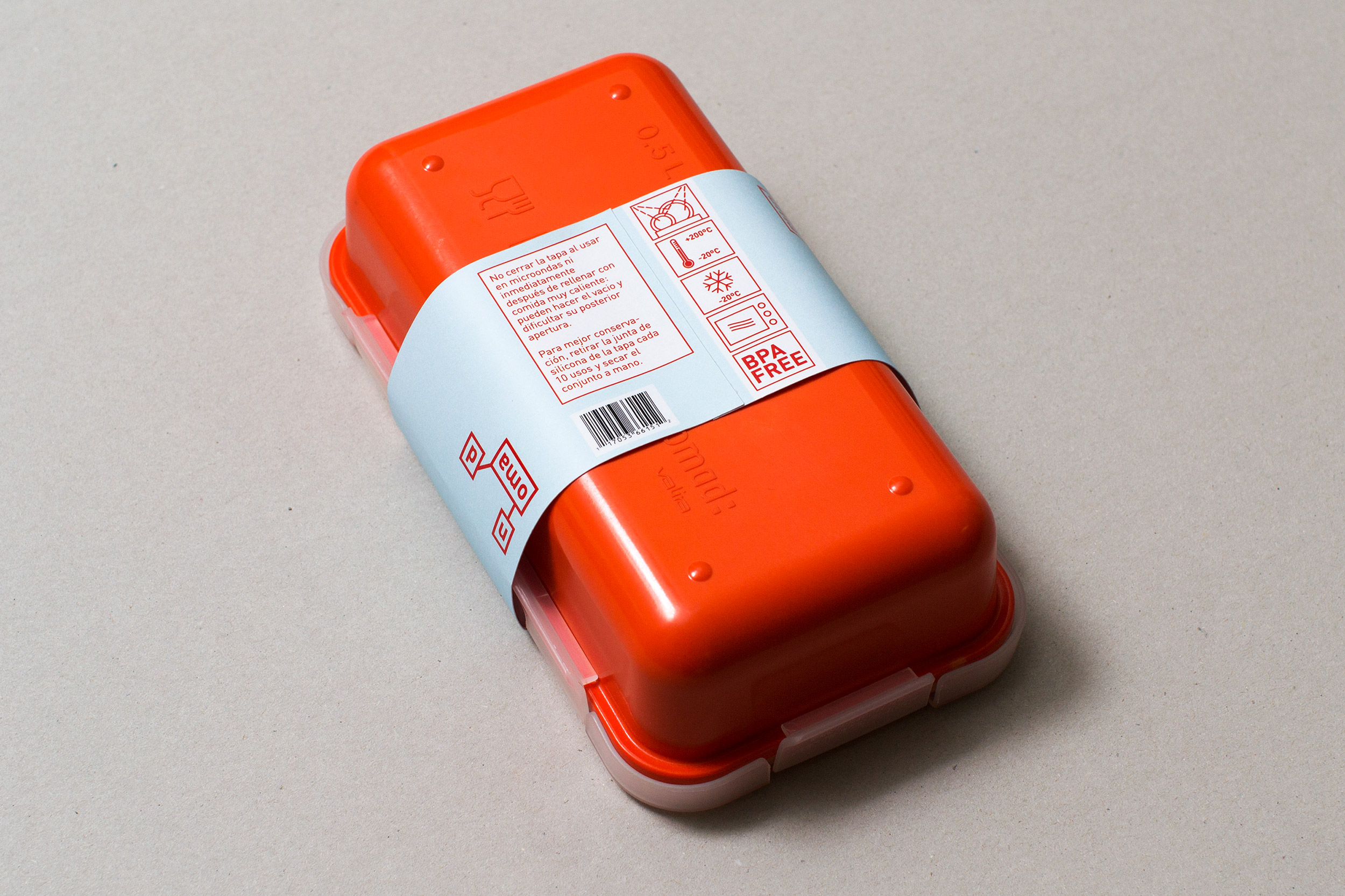
Nomad is a national kitchen accessories company, a range of take away products: tuppers, thermal bags, oil . . . Their target? An urban nomad with a young spirit, who eats in the work of the tupper, for practicality and speed as well as as a way of saving.
Or take the take away bag when making a bike trip. Eating at the university between study days . . . For that reason the concept for the logo was the 3 squares sizes proportions of their tuppers united by the lines like the metro guide.
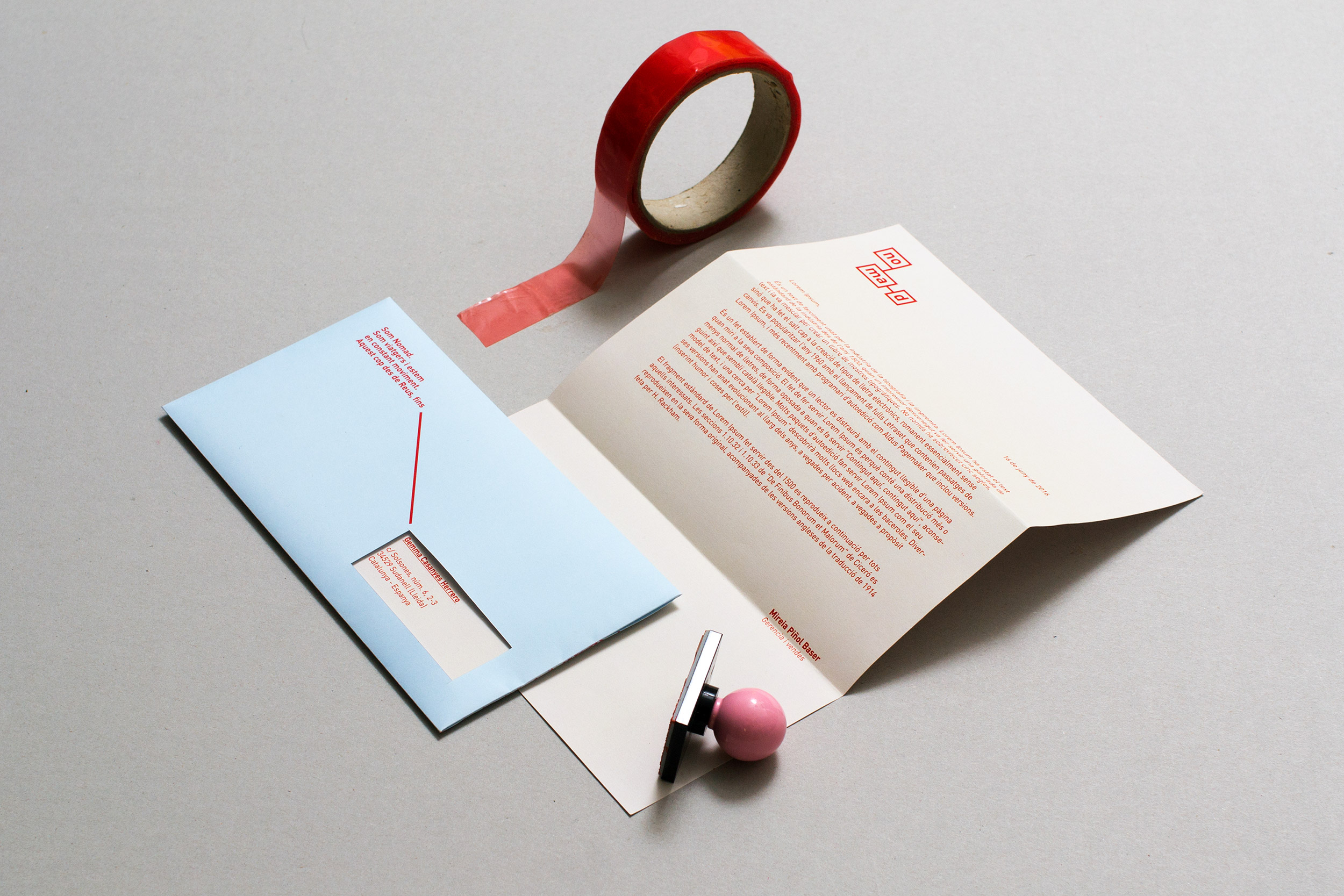
The assignment consisted in updating the communication of said brand. Do a rebranding. From the logo, through basic stationery to the posters of the stands or quick recipe editorials.


