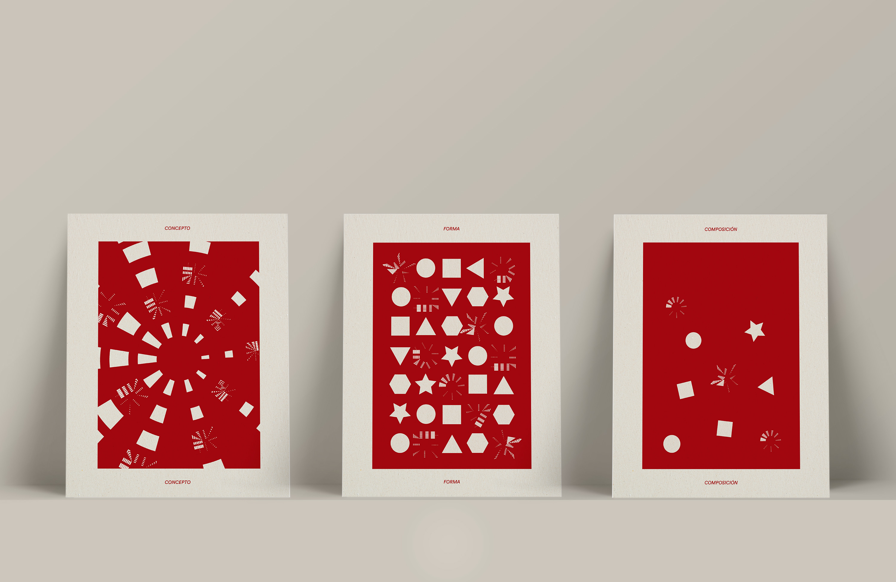
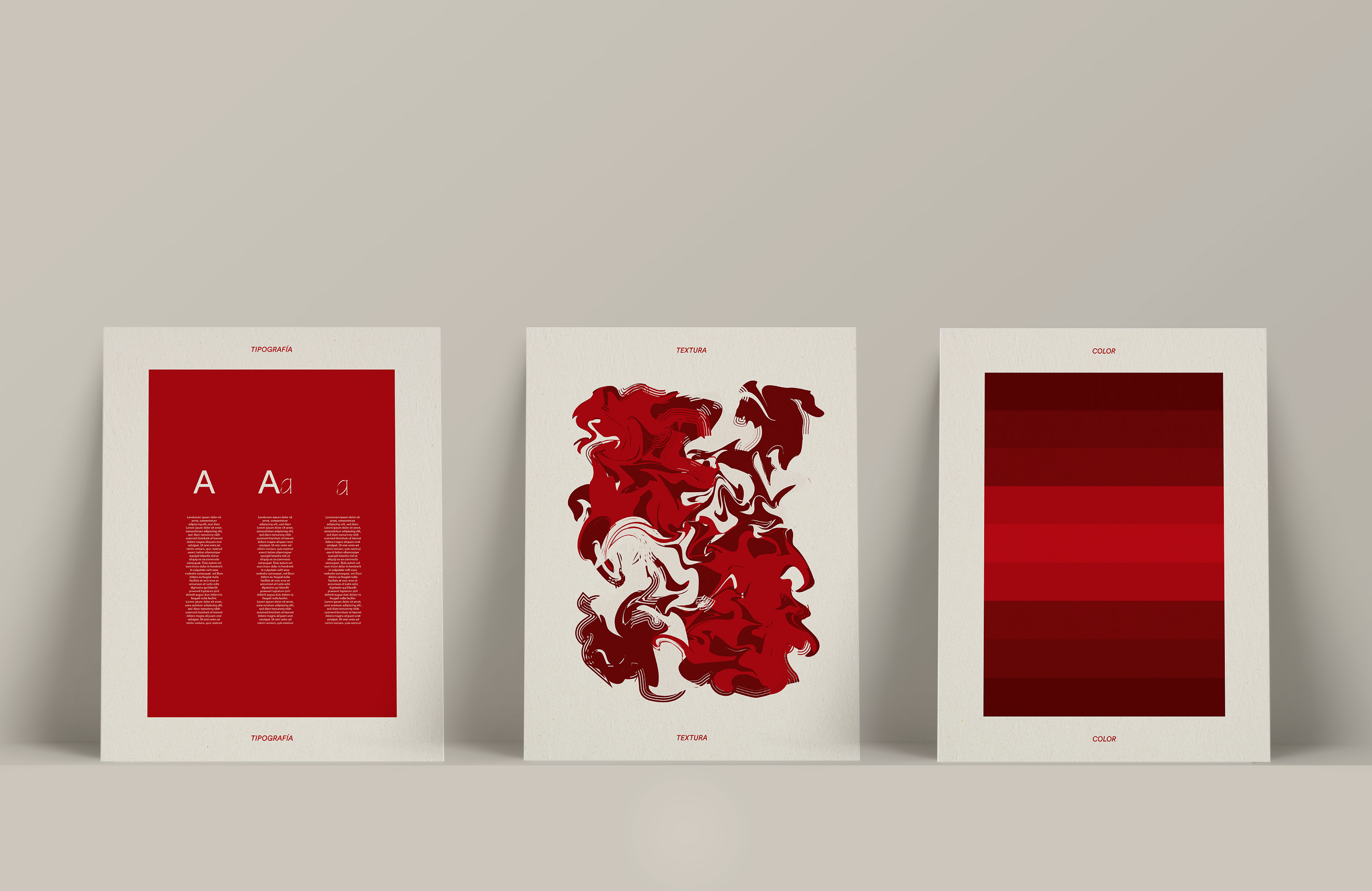
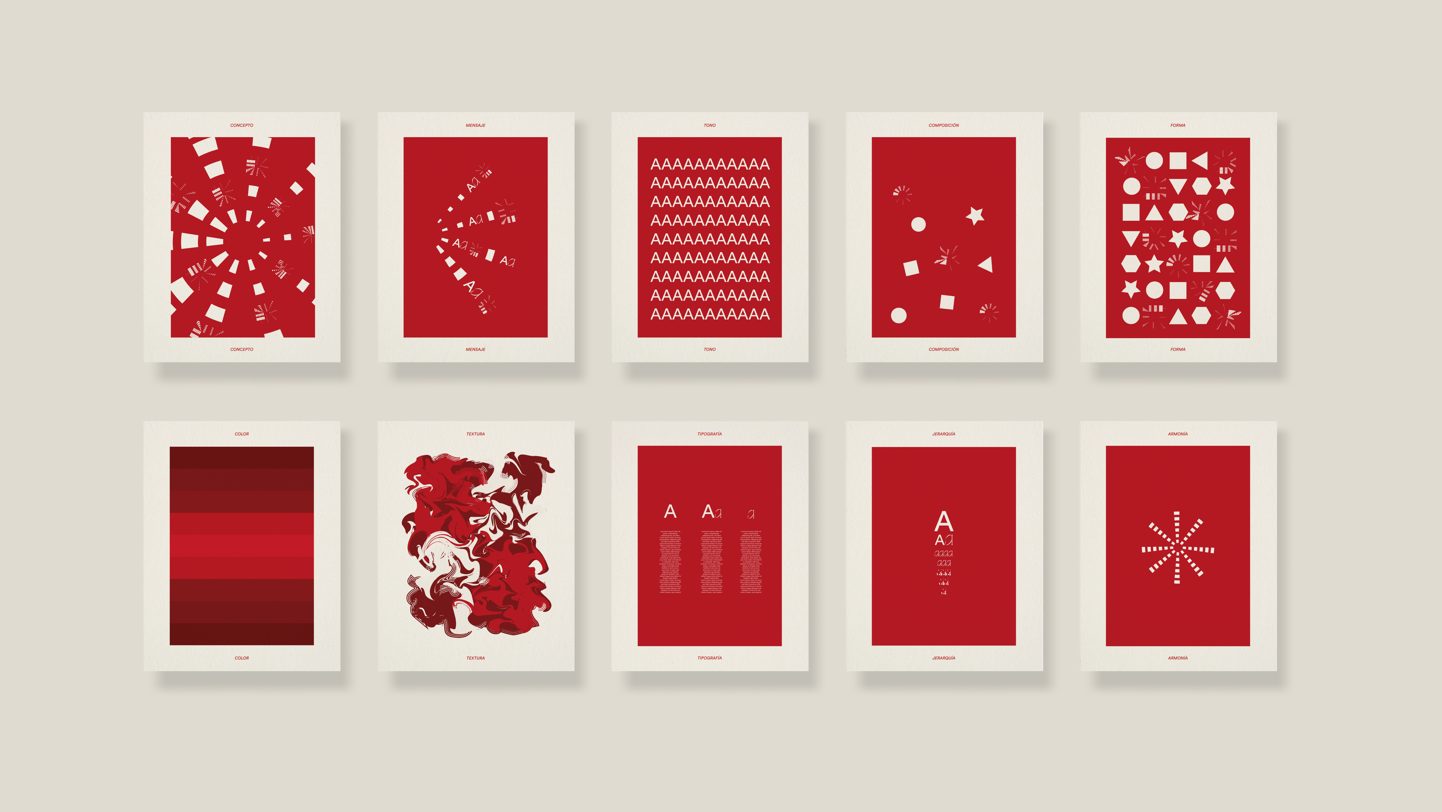
This student project was done for one of the subjects of the master's degree in graphic design that I have taken this year. The main premise of the exercise was to represent in a graphic way 10 fundamentals of design: concept, message, tone, composition, shape, colour, texture, typography, hierarchy and harmony. It was also very important that the final result be understood as a series of posters. The concept of "explosion" and how these fundamentals can be "exploited" in the world of graphic design is the starting point for this project. These posters speaks about the numerous resources that are possessed when creating a graphic language and how they are often used unconsciously, as they become inherent to the designer. This is why most of the forms represented in the posters are exploited. For the implementation of the fundamentals, it was decided to start from simplicity to represent them in a subtle and harmonious way through easily recognisable shapes such as letters or geometric bodies. The use of the margins is done with the aim of creating a base grid for all the posters in order to understand them as a whole. A linear structure has been followed in the design, mainly in the use of colour, in order to encourage the recognition of each of the posters as parts of a whole.


