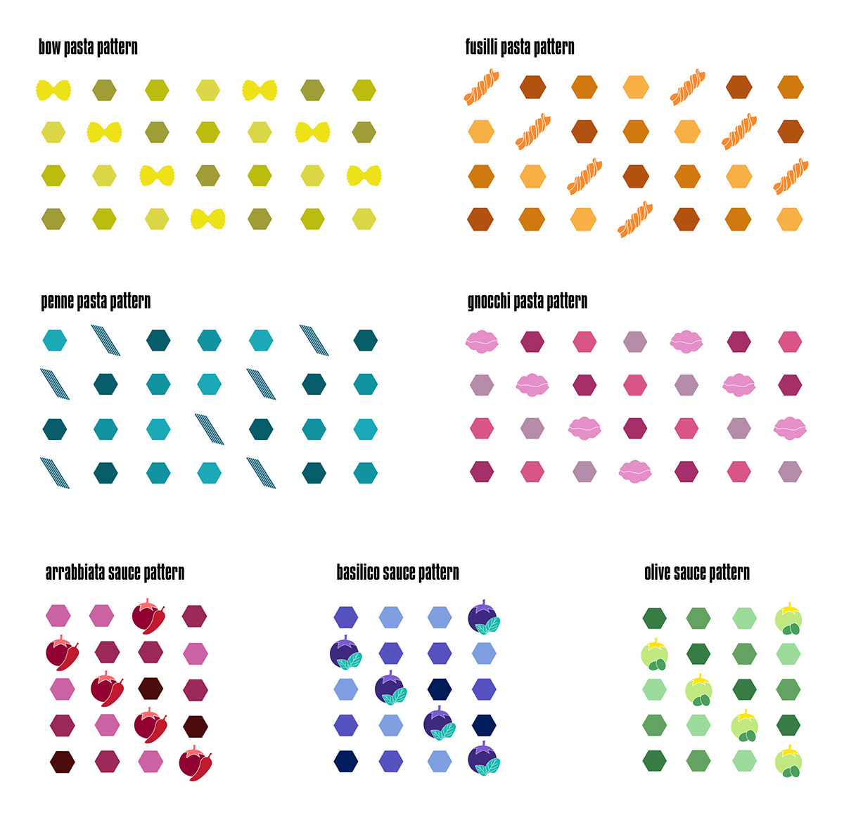
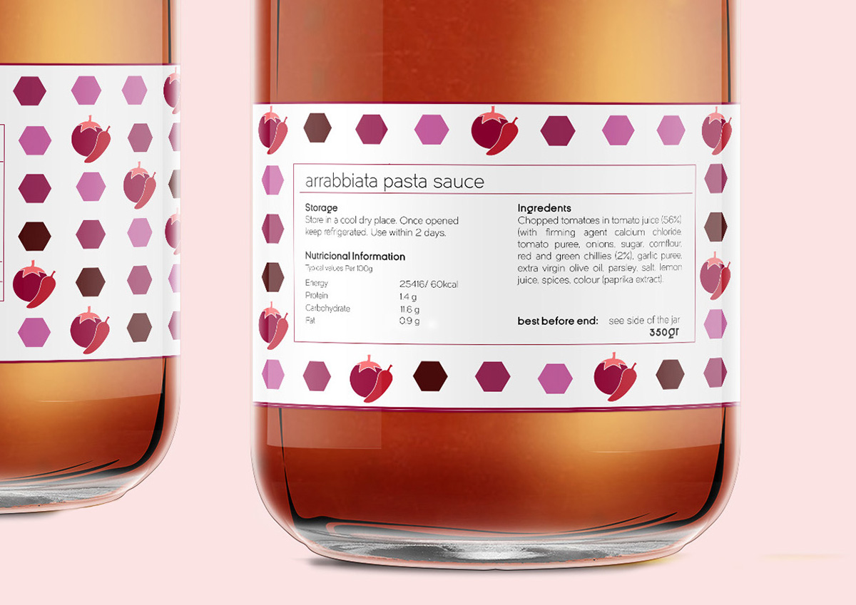
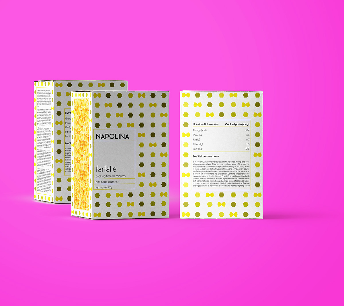
This work was created based on an imaginary brief given as part of our third year packaging course. It was stated that we had to redesign a series of packagings for an already existing brand with permission to change the logo as well as the general art direction of the product range, creating a minimum of two pasta and two sauce designs.
Inspired by Pantone color schemes and heavily based on typography the new packaging designs offer a fresh approach to an old brand of Italian Pasta based in the UK.
The background was kept white in order to keep a balance between the vibrant colors used as the pattern and the illustration that are the center of the concept.
The typography and colors used want to give a modern and youthful look to the product range to attract new customers and happily surprise the old existing ones. The logo followed the new creative direction given and was re-branded to a new and more elegant version of the company’s name.


