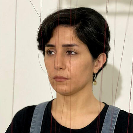
Personal Logo

Roghayyeh Feizi Khankandi

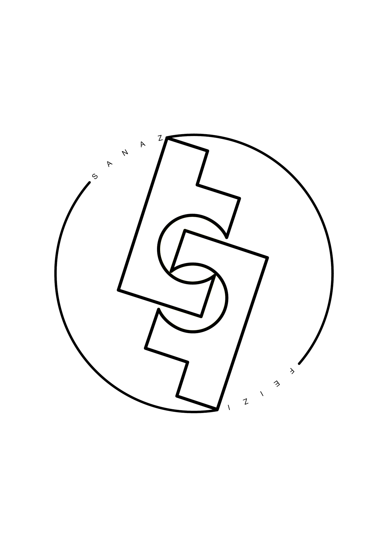
This is my personal logo which is made up of a combination of the letters “F” and “S”. To design it, I used the two letters “F” and combined them in order to reach a balanced composition.

The letter “S” is created using the negative space between the two letters “F”. I also used the circle to express my striving and untiring perseverance, and I have also depicted my flexibility.

My interest in art is rooted in my adolescence. One of my sisters is a painter, and another one is a writer; my mother used to do handicrafts and she made very special dolls that were full of colors and textures.

Growing up in this atmosphere, I became acquainted with art. Besides, living in the mountainous city Ardabil located in the northwest of Iran with spectacular nature and exquisite handicrafts had always kept my interest in art alive.

Spending the vast majority of my…

This site uses cookies

This site uses cookies to provide you with a great user experience. By using the Selected Inspiration platform you agree with our use of cookies.