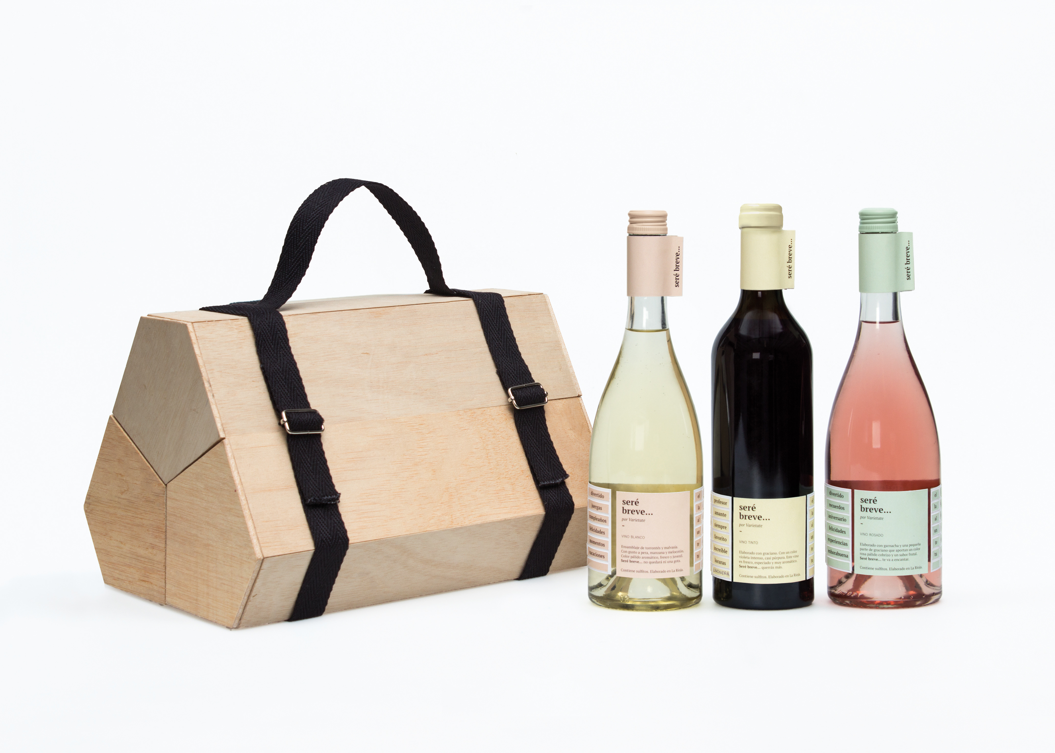
“Seré Breve” (I’ll be brief) is the name given to this wine collection, produced in La Rioja (Spain) by oenology students. It won’t be commercialized. Its purpose is to serve as a gift for their loved ones.
Its target is very broad as it can be given to their friends, parents, siblings, uncles or even grandparents. They all have one thing in common: they love wine. Since the design had to adapt to many profiles, a minimalist approach was used, inspired by the greeting tags that are often seen in gift wrapping, and have written messages such as “Happy Birthday”.
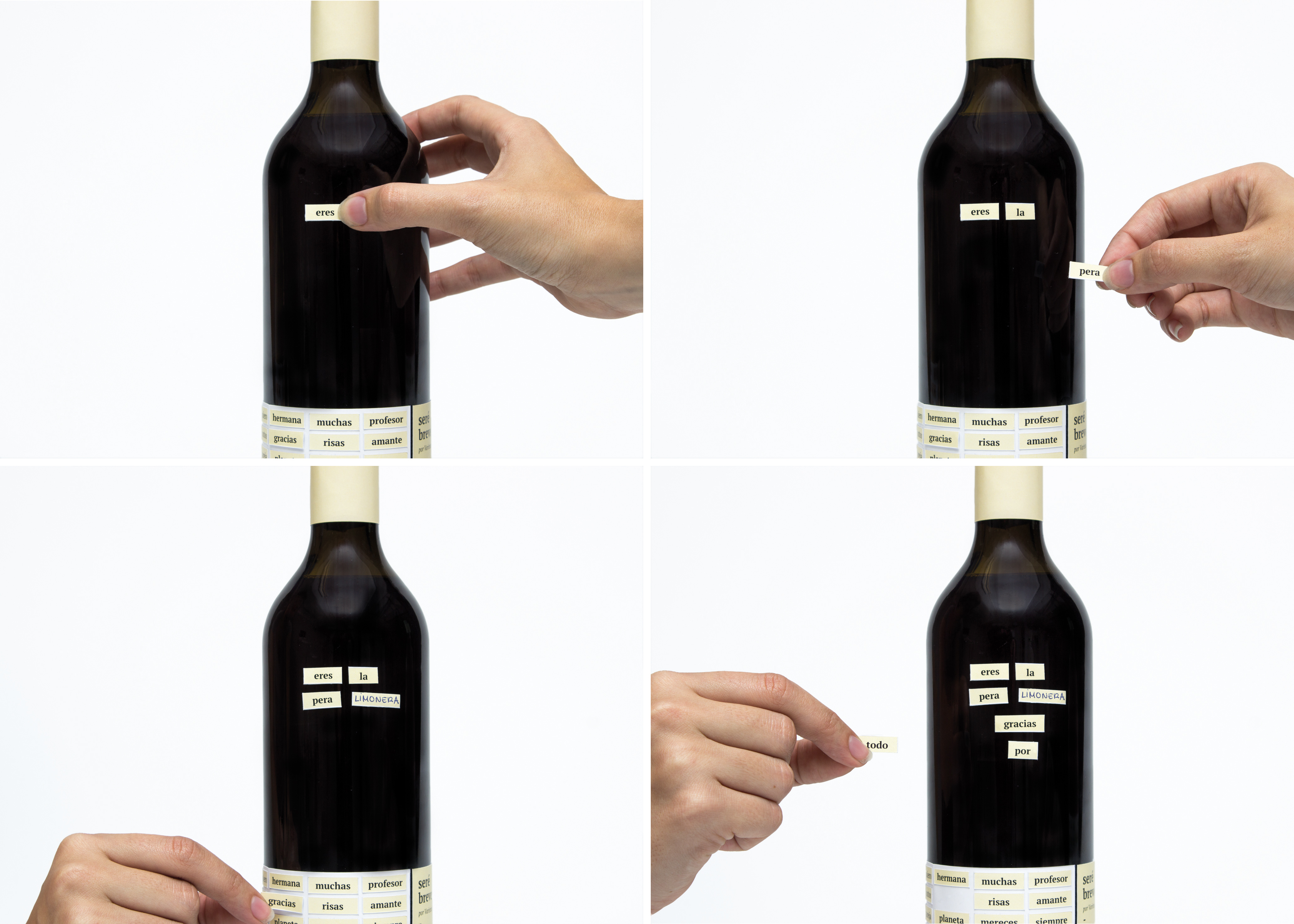
The resulting label works as a sticker sheet. It is die-cut following a grid full of words, creating small tags that can be detached and used to form phrases. The last row was left blank, so the students can customize their gifts.
We worked with soft colors, that contrasted with the color of each wine, to create a simple, straightforward and neat design. This is where the name of the wine collection originates, as givers do not beat around the bush, they express what they feel bluntly.
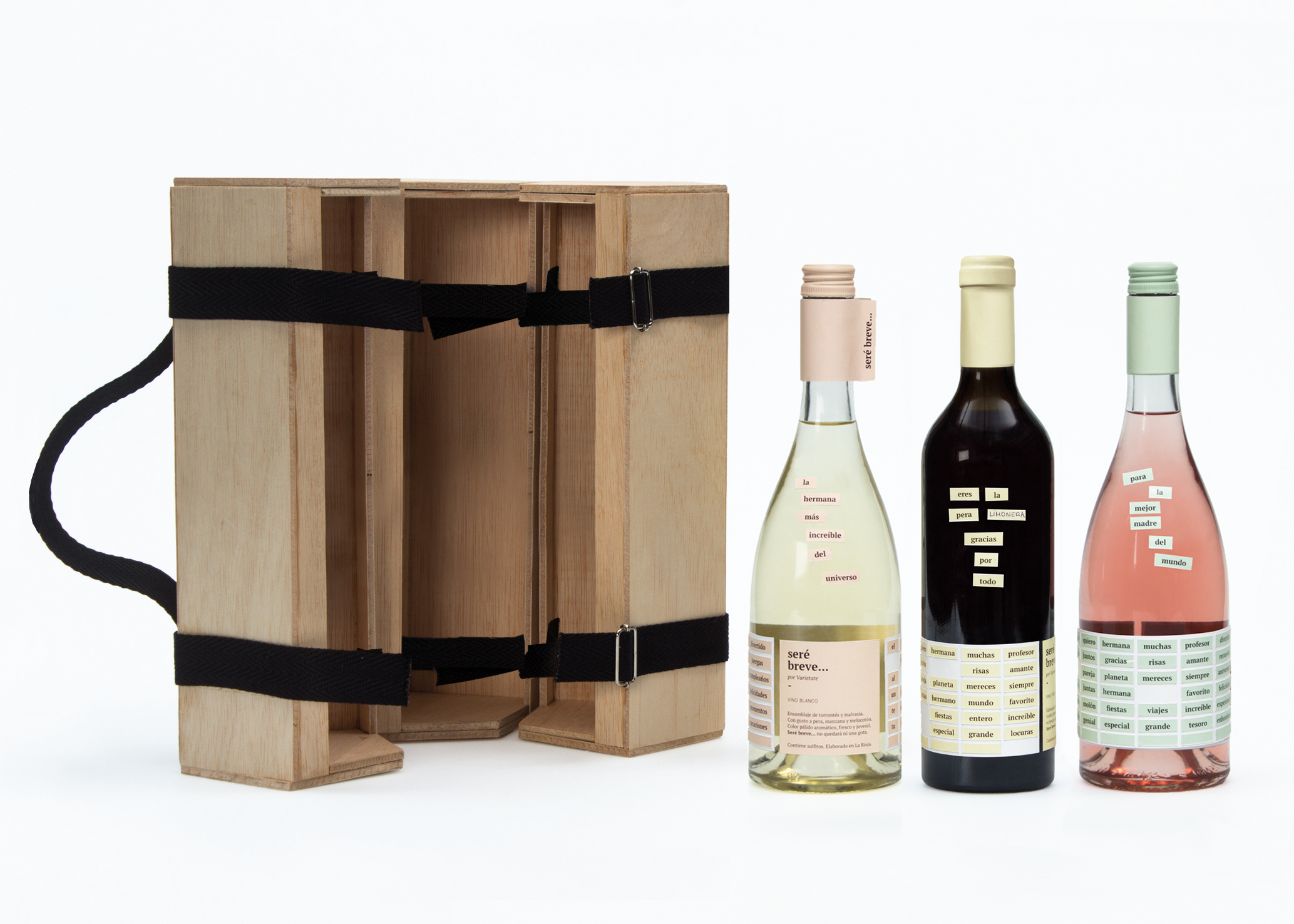
Some examples of the messages that can be written in the bottles, as shown in the pictures, are: “the most amazing sister in the universe” “you are the bee's knees, thank you for everything” “for the best mother in the world”The collection contains two Burgundy bottles, that contain the white and rosé wines, and a Bordeaux one, for the red wine.
They all have the same height. The most remarkable features are the sloping shoulders, and the, relatively narrow, cylindrical shape. Despite having sloping shoulders, they all have a large label area that allows the oenology students to play around with the stickers and write their message.
In terms of materials we chose two different types of glass: clear and green. The first one was used in the Burgundy bottles since, both white and rosé wines were both thought to be consumed in a shorter period of time so there was not a need to worry about oxidation, and, as we said before, we were interested in playing with the color palette of the labels and the natural color of the wines.
On the other hand, because the red wine might stay inside the bottle for a little longer, and to keep an overall classy yet simple look, we decided to use dark green glass for the Bordeaux bottle.
The bottles can be gifted individually or as a collection of three. In which case, they are stored in a box that hides its contents, looking to create a bigger sense of surprise.
It is a triangular case with truncated corners, divided inside in three equal holders, in which each bottle is kept. To assure a safe transportation, there are some straps glued to the holders that keep the bottles from falling and moving.
At the same time, those holders are joined together by two straps that close the case and are used as hinges when the case is open. In one of the corners, there is a handle for optimal transportation.
The sustainability of the packaging was taken into account at all times. On the one hand, printer inks are water-based and adhesives made from milk protein (casein). The case, on the other hand, is made out of poplar wood, not only because it is abundant in La Rioja, but also because it is quite affordable, which allowed us to create a more sophisticated case without compromising the client’s budget.
Lastly, the straps are made out of organic cotton.


