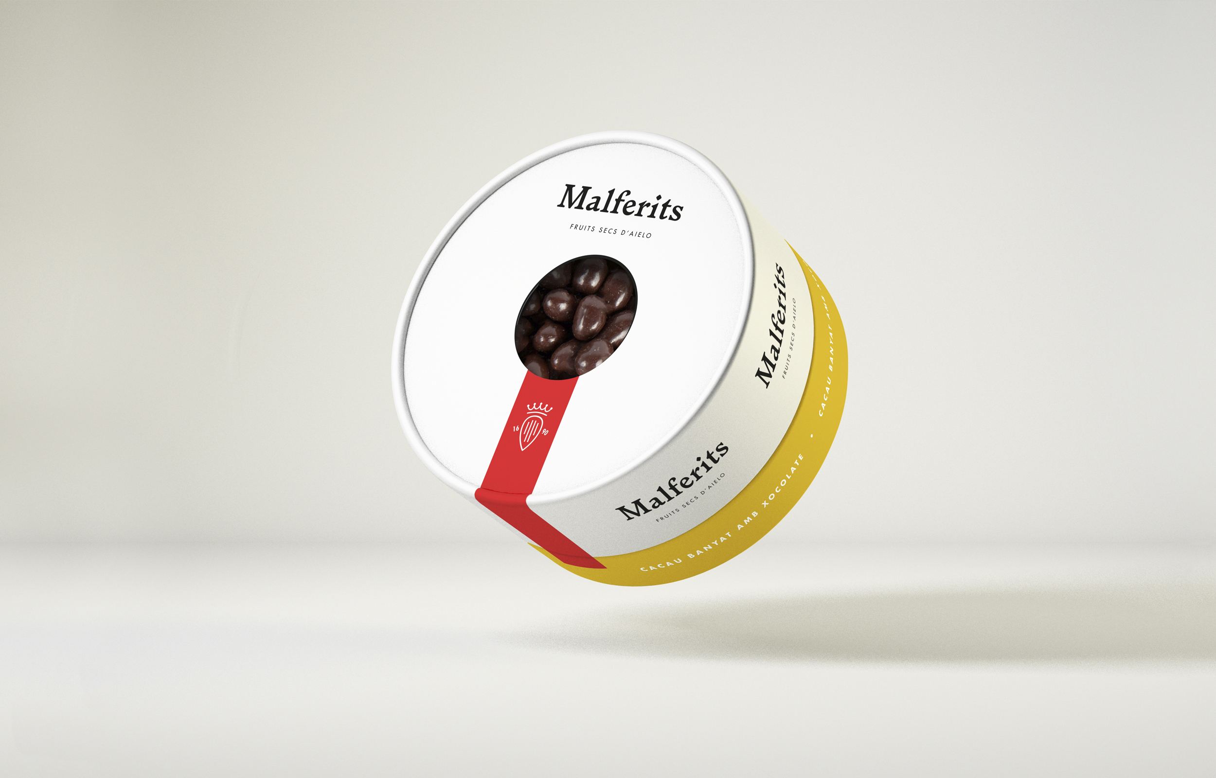
Aielo de Malferit is a small town in La Vall d'Albaida (València, Spain). A nut roaster is located in this town, which works for other brands and has now decided to create its own brand.
It's a company dedicated to the people, and many inhabitants of the town work there, which is why in the brand creation process I decided to focus on "the town”. Why Malferit? Inquiring into the history of the town's origins, I discovered that in the 15th century the lords of Malferit helped to give splendour to the town of Aielo, and later they were named marquises of Malferit, thus, the village was renamed Aielo de Malferit.
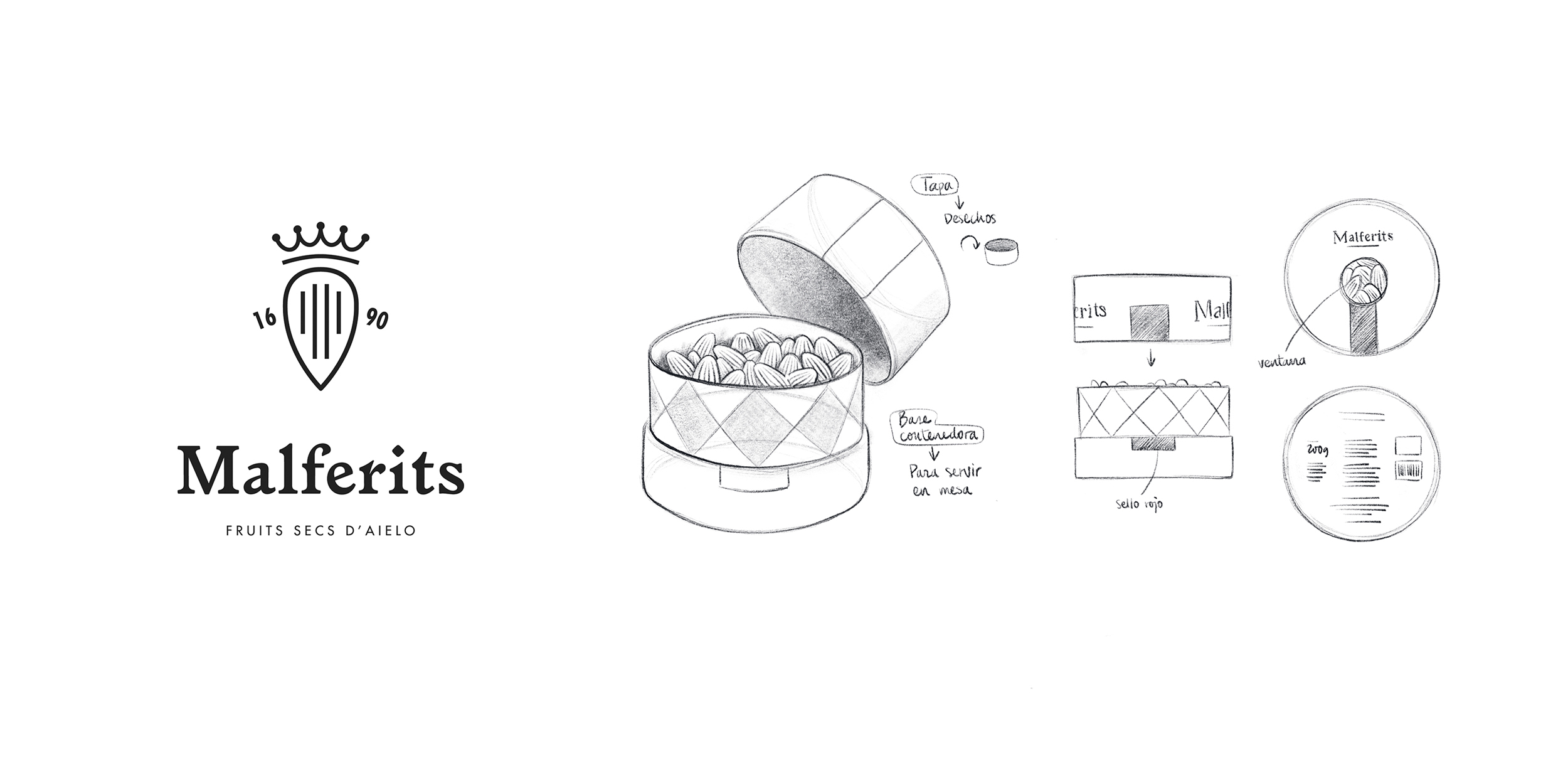
In the brand I wanted to reflect the medieval origins of the town and give it a historical treatment alluding to the Valencian Golden Age of the time of Joanot Martorell, through heraldic references in the chromatic range and the use of medieval-inspired typography, but with a minimalistic and contemporary style.
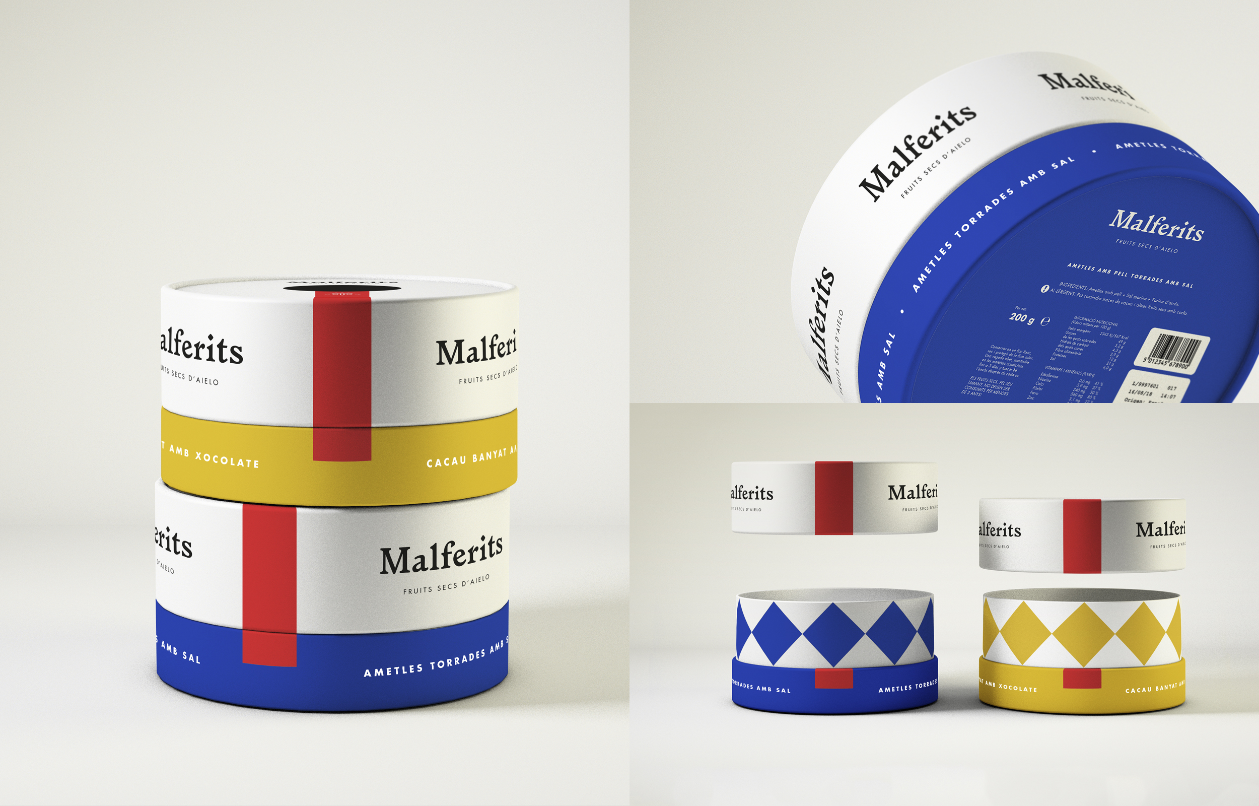
I've used blue and yellow to distinguish the line of salty and sweet products. These colours correspond to the coat of arms of the Malferit surname (gold and azur in heraldry) and are the colours of the town's shield.
In addition, the concept of packaging aims to be multifunctional, as the packaging itself allows to present it on the table and the lid allows the nut shells and peels to be deposited.
It was a fictitious identity and packaging project for a fictitious client for the Corporate Identity class at EASD València. Project tutored by Nacho Lavernia. Project published on:
http://www.thedieline.com/blog/malferits-nuts-branding-and-packaging-from-a-marquessate
https://www.packagingoftheworld.com/2018/04/malferits.html


